Browsing Tag

before and after

House Progress, Room Tours

Shared Toddler Room Reveal! – Spring One Room Challenge Week Eight

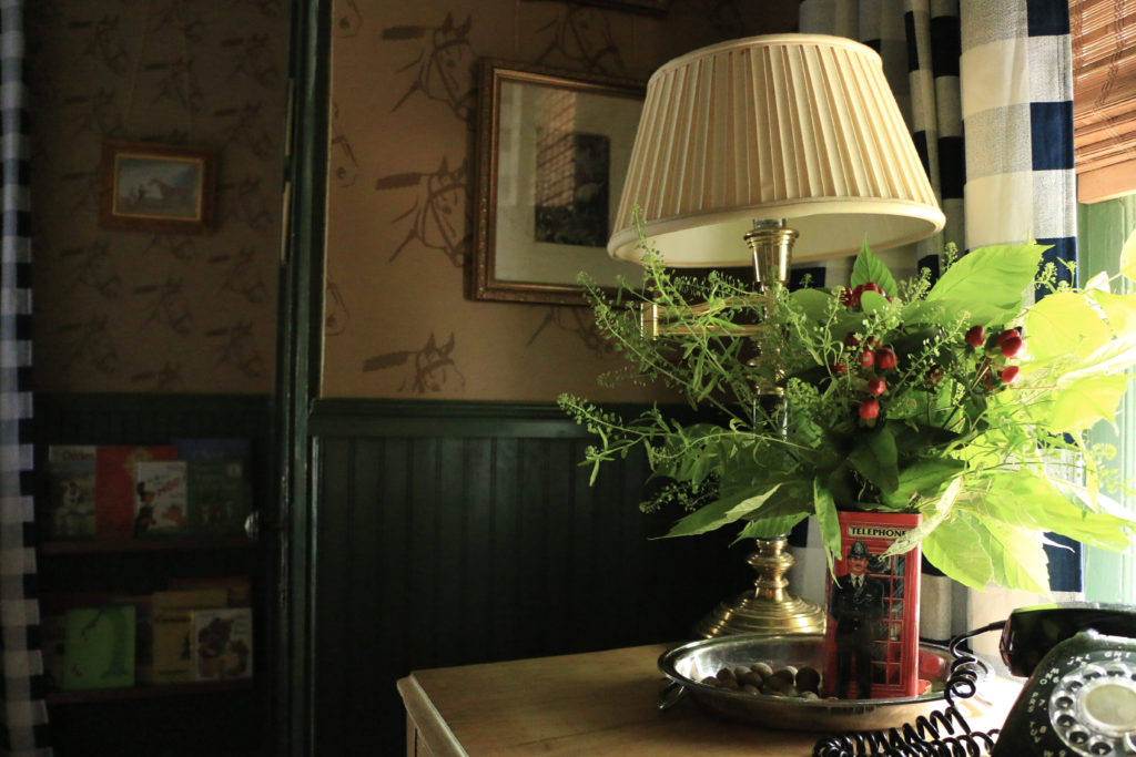
I cannot believe this room is finished! It’s been eight weeks of super intense working on making over my son’s room for my son and daughter to share. Their gender neutral, English country inspired room is just what I envisioned and I can’t believe it’s come to life! Or that I did 90% of it by myself! As a quick reminder before we dive into it, let’s just take a look back just eight short weeks ago:
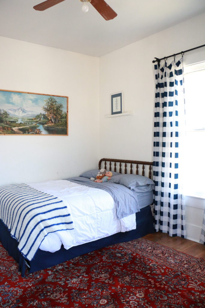
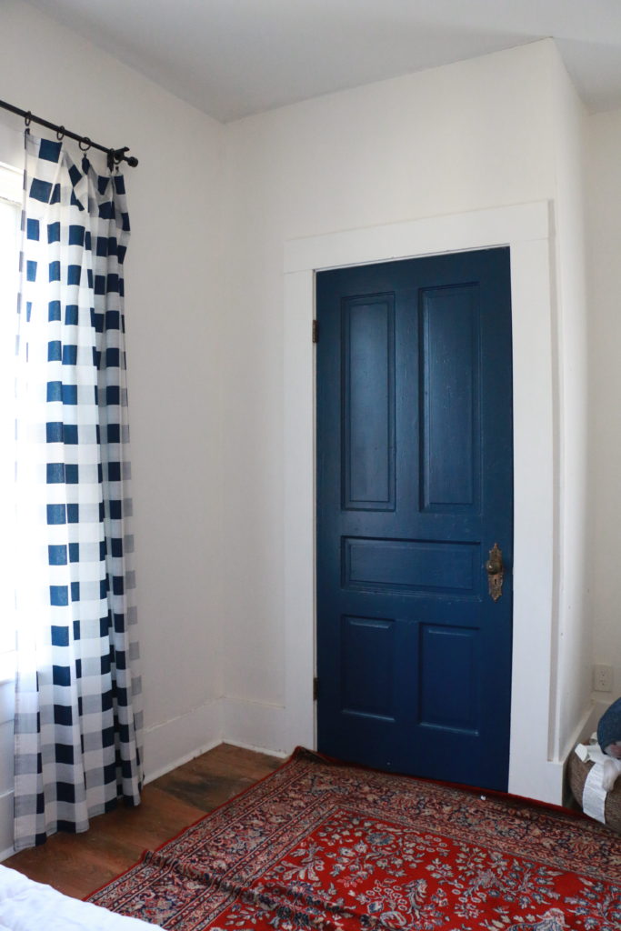
Boring and basic, the floors had been refinished when we first moved in, and the walls painted white, but that was about it. The room itself didn’t have a “design.” Now, hold on to your hats people, because I cannot believe this is the same room.
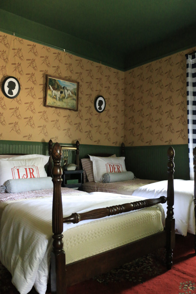
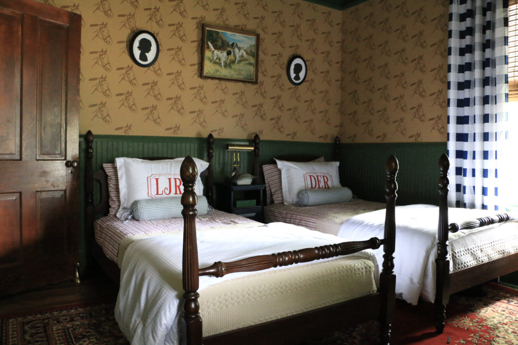
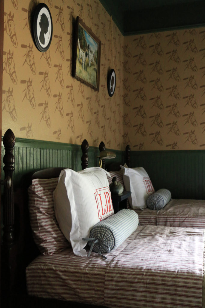
We added the beadboard, chair rail, and picture rail ourselves, and I used a stencil that was generously gifted by Stencil Revolution to give the upper portion of the wall a faux wallpaper look. The green is Equestrian Green, the tan upper portion is called Windswept Leaves, and the stenciled color is called Split Rail, all by Behr. The walls alone really make the space and give it the antique, English, equestrian vibe I was going for. The white was necessary for a quick move in timeline, but it’s time it got some character.
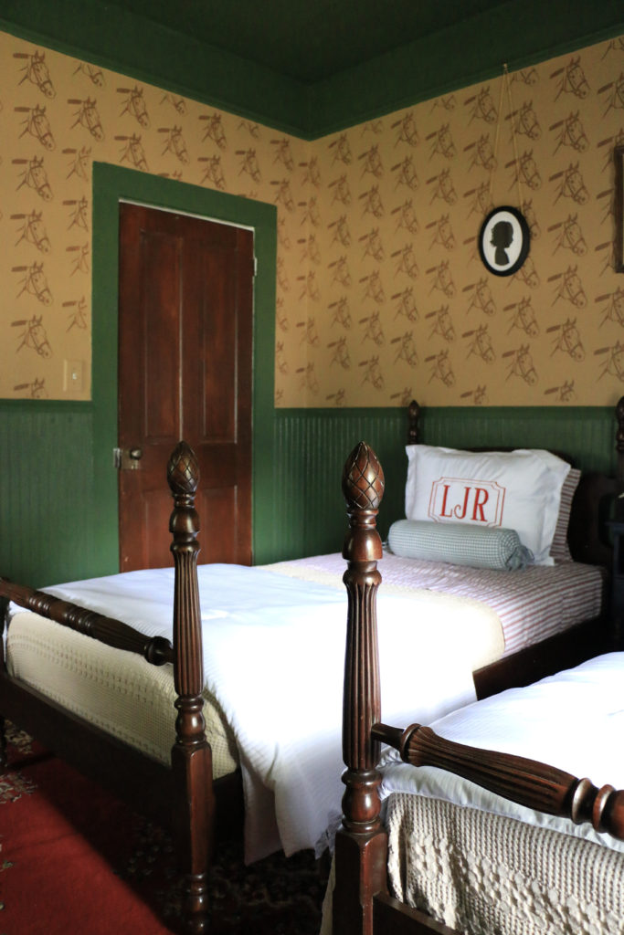
The beds were my launching off point for the rest of the design. I found them on Facebook Marketplace almost a year ago, and I’ve been storing them in my garage until now. I bought them from a sweet retired couple who used them when their children were small. They had bought them at an antique store in the 1980’s, but they believed they were from the turn of the century. It was meant to be because so is our house!
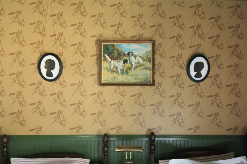
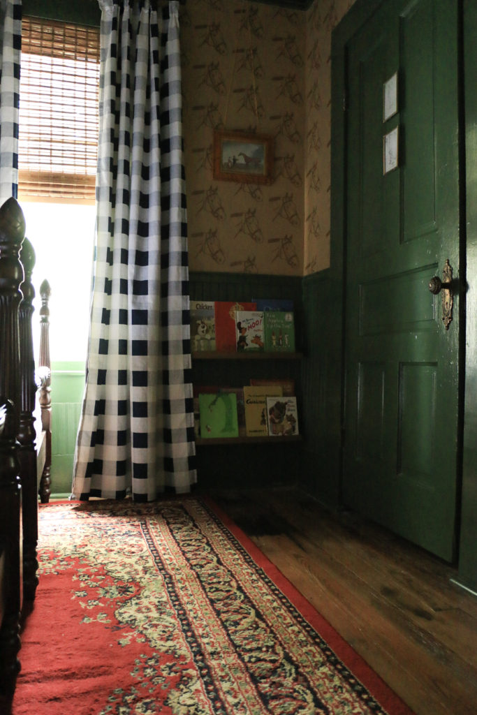
Most of the art and decor was found secondhand at estate sales and thrift stores. I reused but reworked the curtains by adding blackout liners and drapery pins. The dresser is also the same dresser that was in here before, but it looks much more fitting now. More on the dresser in this post.
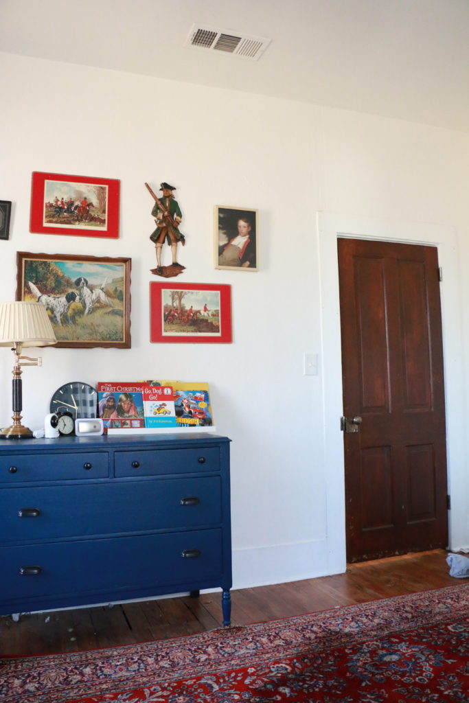
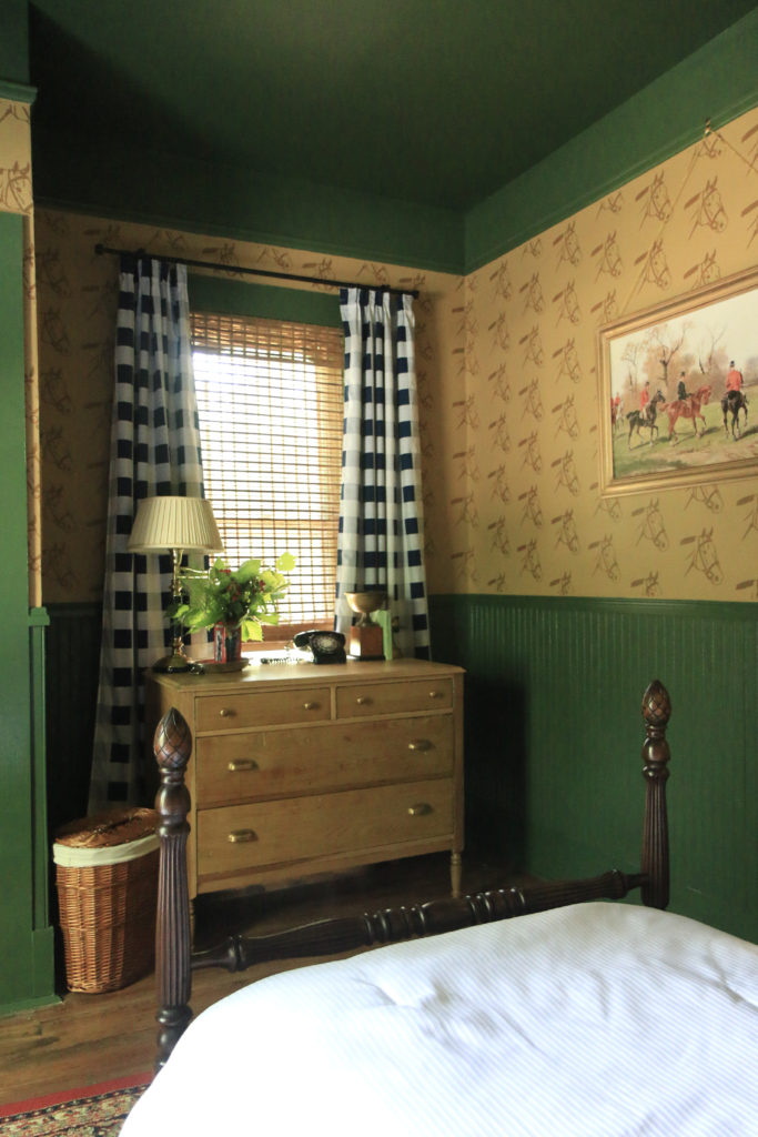
Dresser Before

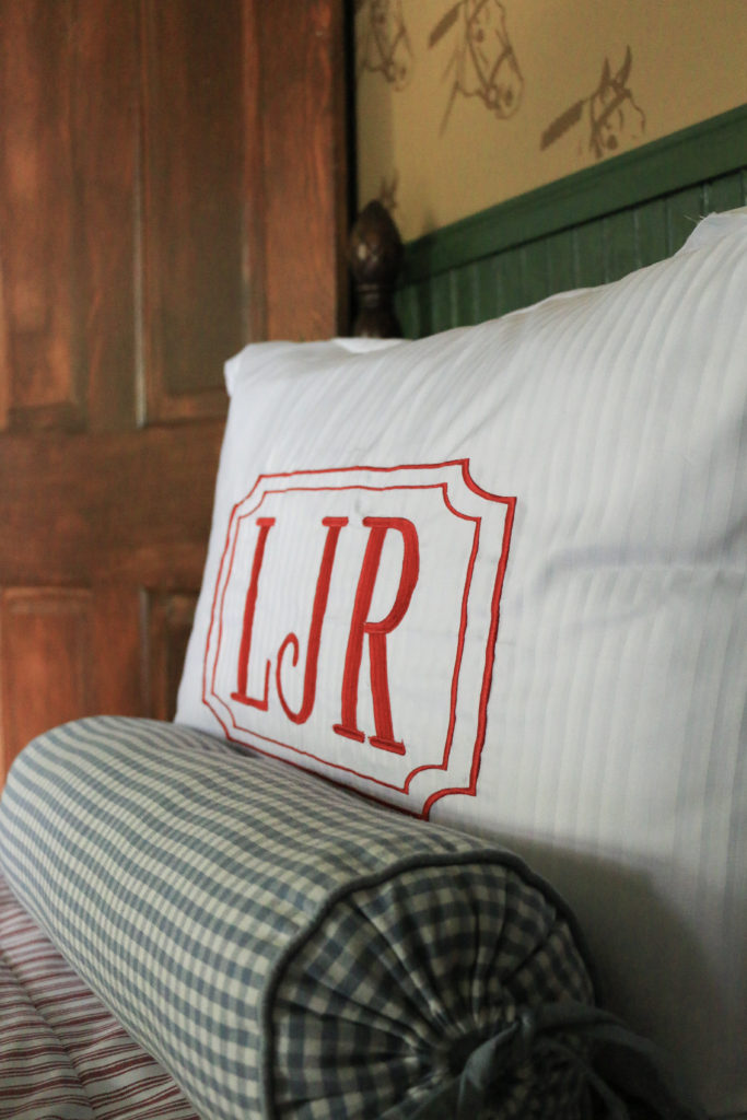
The pillow shams were from a basic set, but I had them embroidered locally. I had a hard time finding someone who could do exactly what I was looking for, but the ladies at The Perfect Pair were so helpful and worked with me to get exactly the look I was hoping for. I think the monogrammed pillows give it a touch of class (as classy as two beds made up for toddlers can be).
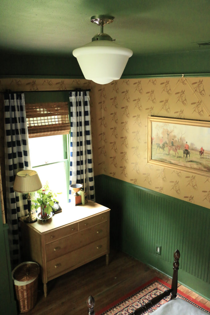
The light fixture was a $50 Amazon find (I know!) which worked well to replace the old shadeless ceiling fan that was there with something that looked like a cute vintage light but came with the ease of modern wiring and installation.

Because most of my items were found secondhand, they aren’t linkable, but what I did purchase new is linked below.
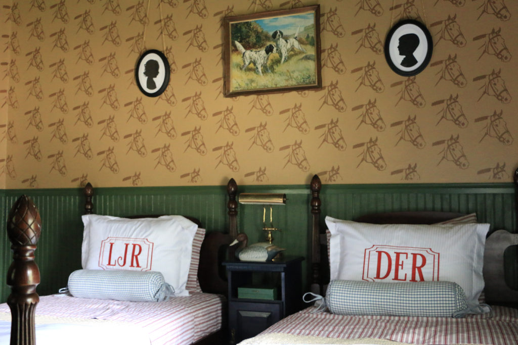
Thank you so much for stopping by and checking out the kids new space. This is a room that I’m really proud of, and is something that I truly feel is a reflection of our home style. I worked on this solely during naptimes and after bedtimes for the last two months, and every time my oldest woke up, he would immediately go to “the new room” and check on the progress. Both of the kids love the space, and they can’t wait to spend their first night in the newly made over space. I wanted to make the room feel sophisticated but also fun and whimsy, and I’m so pleased with how it all came together.
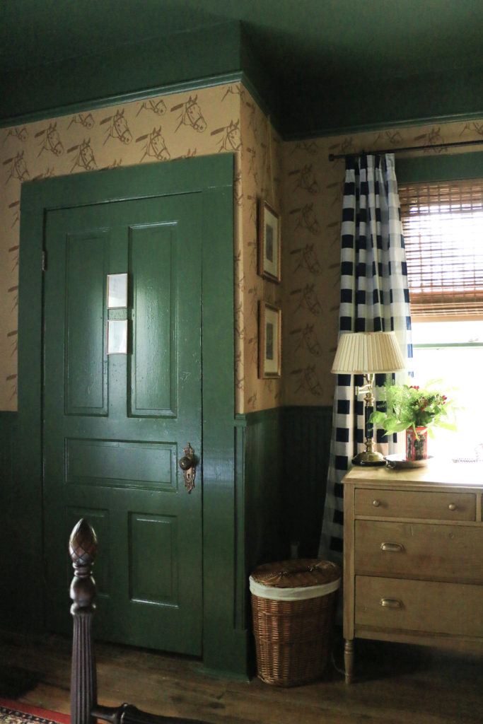
Now, remember this? This was the original moodboard for the design. I am so thrilled to see it in the flesh. It’s honestly the nicest room in our house now.

And last but not least, just one more for the road. I truly cannot believe this is the same room.
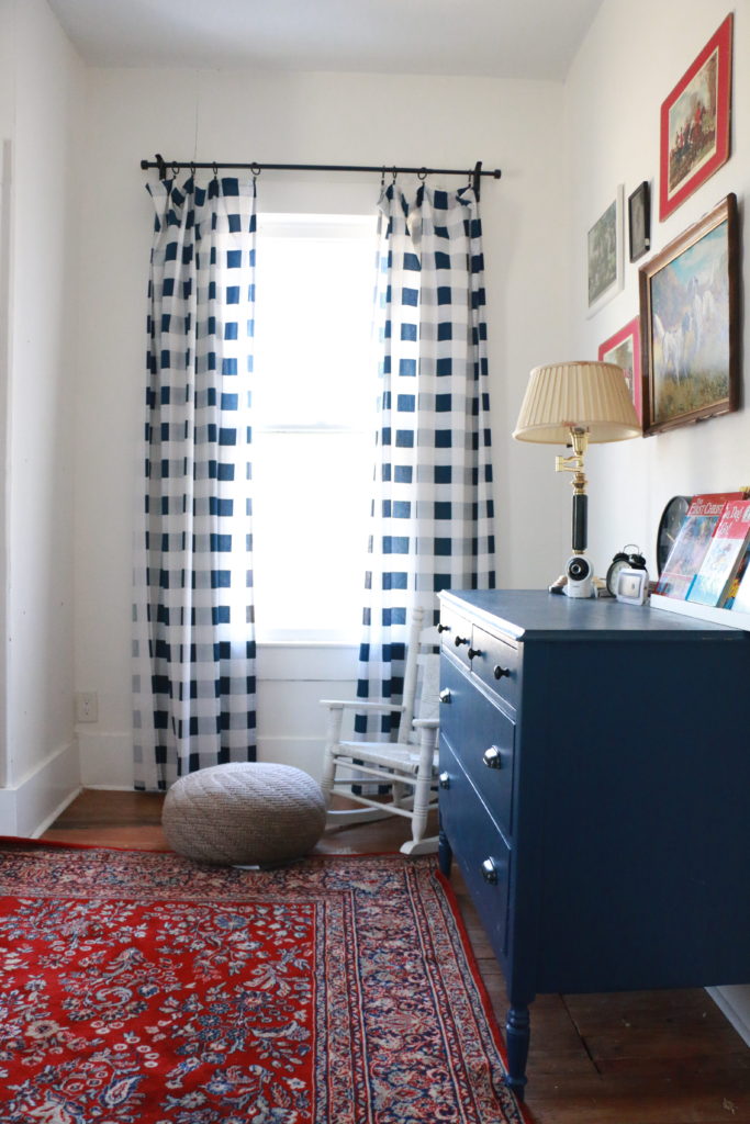
I would love to hear your thoughts! And after you’ve let me know what you think, be sure to go see some of the other great reveals happening today. That’s all for today, friends! Have a fabulous day!

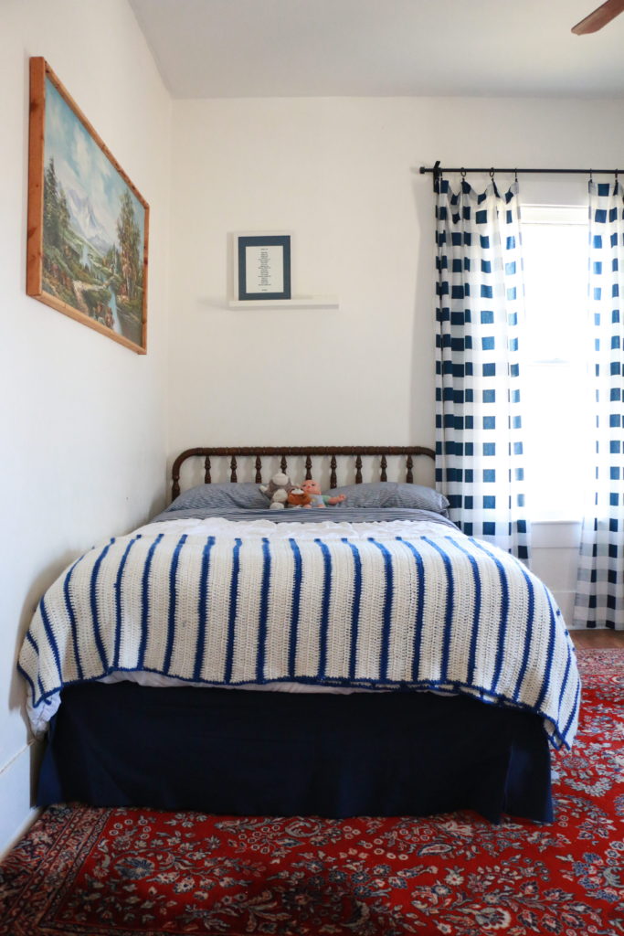
House Progress

Spring One Room Challenge Week One: The Plan

They say necessity is the mother of invention, right? So here I am once again, changing a kid’s space to make room for another baby. My youngest is getting booted out of the nursery, so we will be having our two children share a room for the first time. To get them excited about the transition, I knew I wanted to do something special in the room. The trick here is that our almost four year old boy and our almost two year old girl will be sharing, so I didn’t want it to be too boyish or too girlish. I also wanted to take into account my kids’ likes and interests while blending them with each other and still fitting in to the rest of the house.

I’m excited to share the design board for the space, which will be along the lines of a “traditional-English Country-but-still-sophisticated-for-a-toddler” space. Our home was built in 1895, so you know I just can’t bring myself to anything too trendy.

This room is actually my son’s current room. It was his nursery which we hastily threw together in the few weeks between the time we moved into the home and the time he was born. As he got older and transitioned out of a crib, we brought in a bed, and took out the rocker, but that was about it. We never did much to make a “big boy room.” The light fixture is still a broken ceiling fan that was there when we moved in and never replaced. It’s long overdue for a makeover, and since it’ll soon be housing both my son and my daughter, I figured this was the perfect time. I’m super excited to be working on this space over the next several weeks and finally bring this room to a fully finished space.

As you can see, it just kind of looks like a collection of things that got added slowly over time, and not in a good way. It’s haphazard instead of intentional. I do plan to reuse some of the things in the room, but a lot more is coming.

Be sure to follow along as I make this room into a room I hope both my toddlers will be excited about. I also can’t wait to see what other DIYers are doing in their spaces, and plan to follow along with them too! I’ll be sharing lots of real time updates on Instagram, and weekly progress reports here too. That’s all for today, have a fabulous day!

House Progress

The Power of Paint (A Phase One Bathroom Makeover)

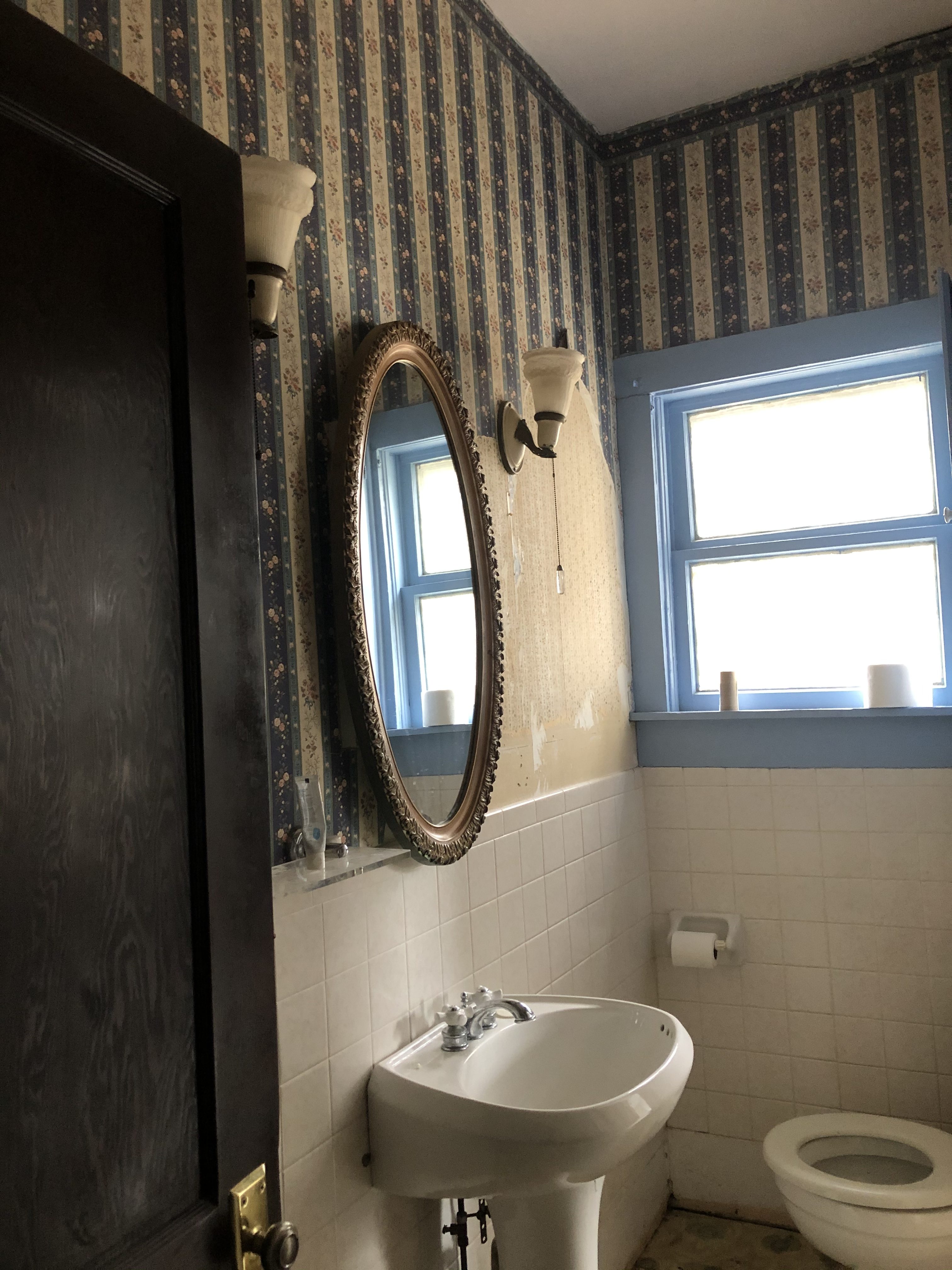
Hi there! Thanks so much for stopping by today! Boy oh boy, do I have a before and after for you today! First, let’s get the backstory. We bought our home from a realtor who had purchased the house at auction following a foreclosure. That realtor listed it for sale, but went back and forth about whether he wanted to flip it himself. When we bought it, there were a few random half hearted attempts at restoration work. One random door frame stripped of paint, carpeting partially pulled up, wallpaper torn off in just a small section of a room. That was the case in the room I’m going to show you guys today.

So the upstairs of our house has three bedrooms and a full bathroom. When we did our first big amount of work in the months before we moved in, the only room we touched upstairs was the first bedroom for our son, leaving the bathroom and two bedrooms untouched. The house was built in 1895 with no indoor plumbing, and therefore no bathrooms. I’m not sure at what point it was added, but at sometime, a bathroom was poorly shoved into what would have once been a spacious hallway between the three upstairs bedrooms. This leaves us a bit perplexed as to what to even do with the bathroom, because the floorplan of the second story is a bit wonky. I’d love to someday see that turned back into a hallway, but alas, we need more than the outhouse that was originally here. Knowing that this bathroom was going to involve some structural changes, and that our needs in the house/bedrooms may change as we have more kids etc., the upstairs bathroom was literally at the bottom of the priority list. Out of sight, out of mind.

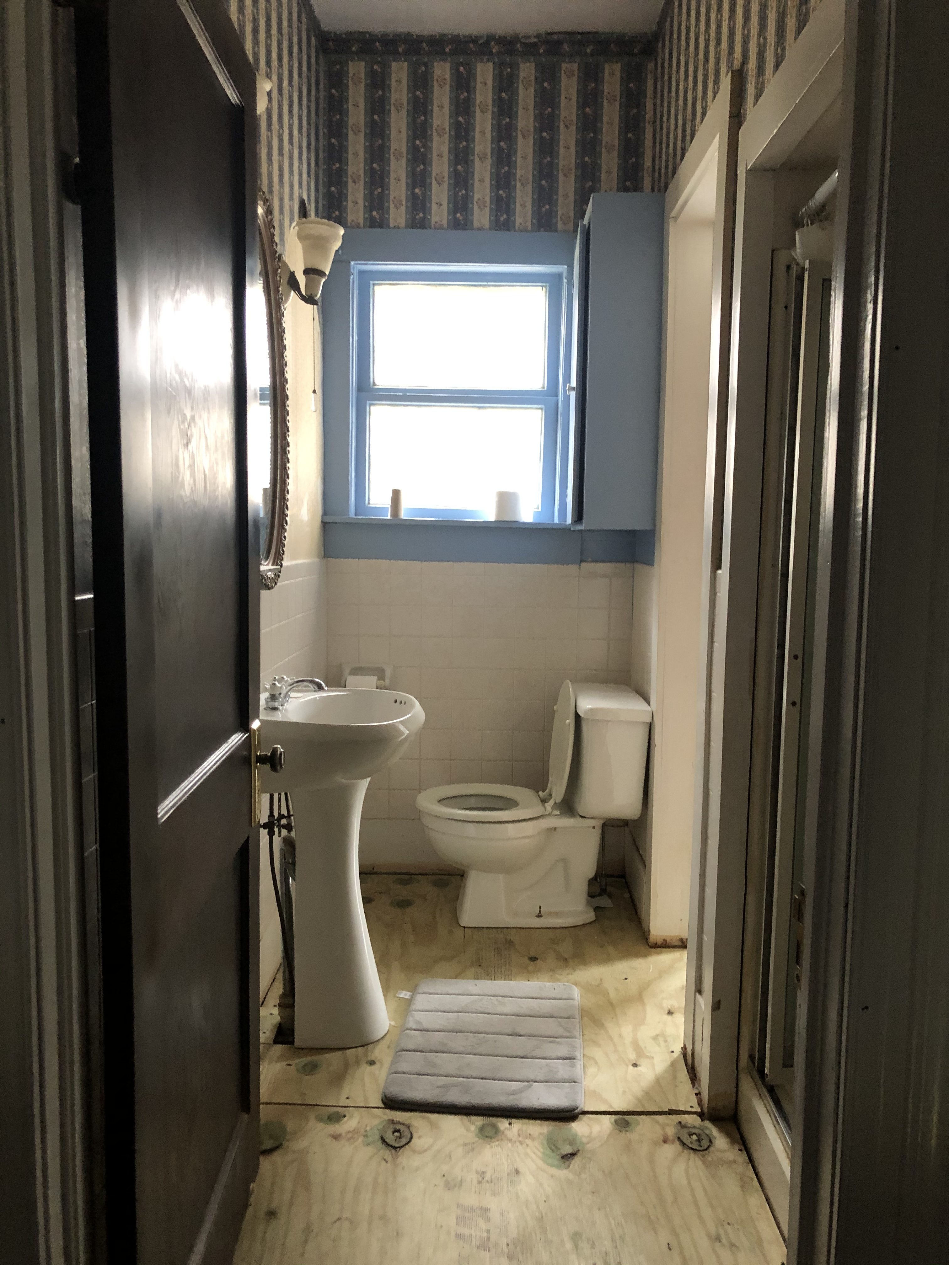
Until, that is, we moved the master bedroom upstairs. Then all of a sudden this upstairs bathroom was a little more on the forefront of my mind. I lovingly nicknamed this room “the dungeon bathroom,” because I was so scared to use it. Everything was fully functional, but the carpet (yep, this thing had carpet) that had been in there had been waterlogged and soaked through the subfloor. My brother actually pulled up the carpet and old subfloor and laid down new plywood. And that’s the extent of work we had done in the dungeon bathroom. But now our bedroom was right next to it, and it was a pain to go all the way down the creaky stairs right outside of our son’s room in the event that I needed to go to the restroom in the middle of the night. So I knew I needed to do something. But again, of all the “big projects” we have planned for the next couple years, this one is quite literally the last one on the list. So I decided to give it a little cosmetic facelift, a Phase One makeover to tide us over until we would eventually remodel this bathroom. So, without further ado, here is the dungeon bathroom.

For days, I worked during naptime and after my son went to bed to scrape wallpaper. Most of the wall had two layers of paper, but in some areas, I found four different papers laid on top of each other. It was grueling. I used a handheld steamer and a wallpaper scraper and would work in tiny six inch square sections. It took a long time, and my arms arched.

As I scraped the wallpaper, I found that some of the drywall had been damaged, and had simply been disguised by the paper. That meant we had to do some patch work on the walls. I had to sand it all down to get the gunky wallpaper paste completely gone. All of this was before I ever started painting!

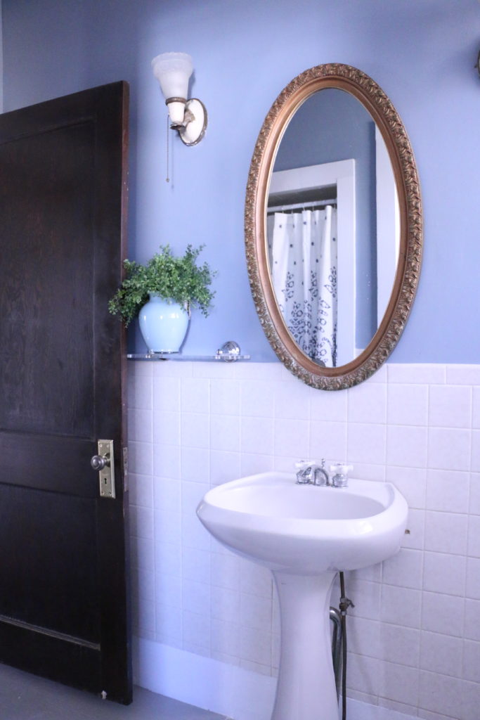
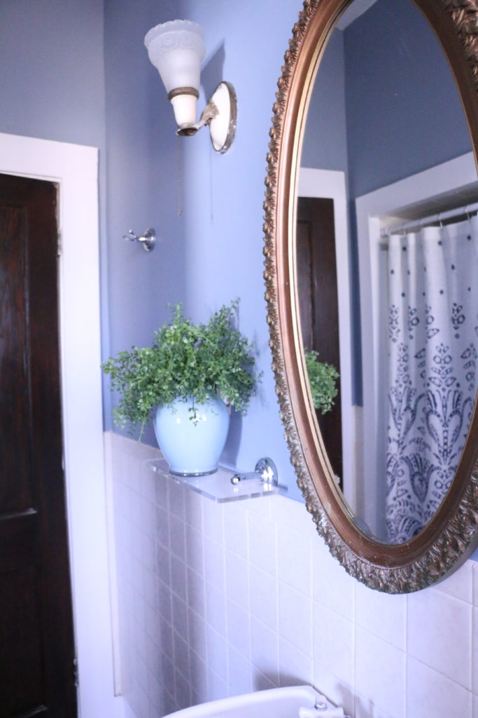
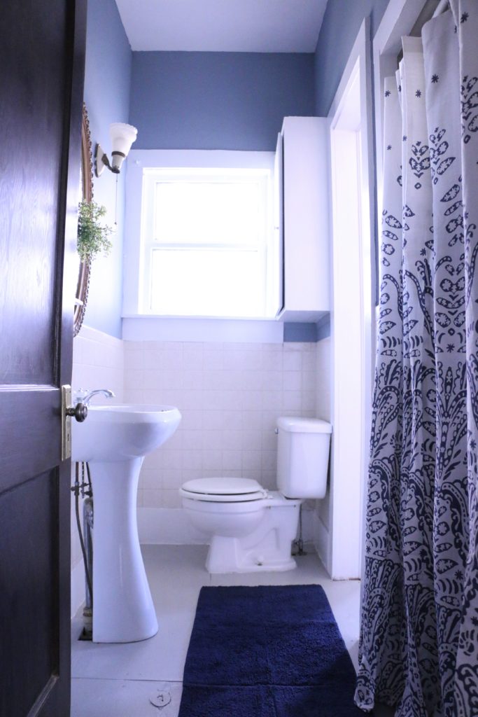
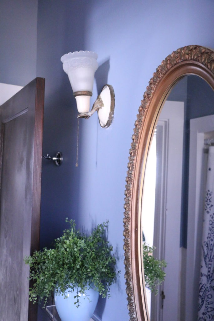
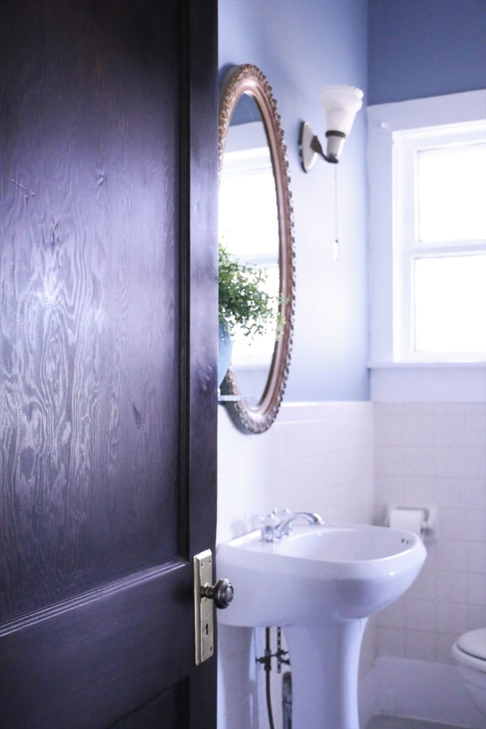
I originally planned on only using products that I had on hand to do this bathroom, but I ended up purchasing the wall color because I didn’t have as much paint in the garage as I thought I did. The color is Behr French Colony, and I think it’s a lovely blue-grey.

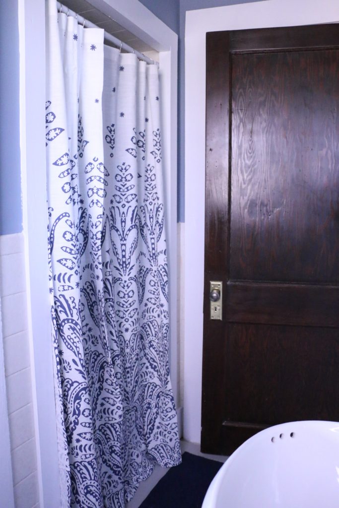
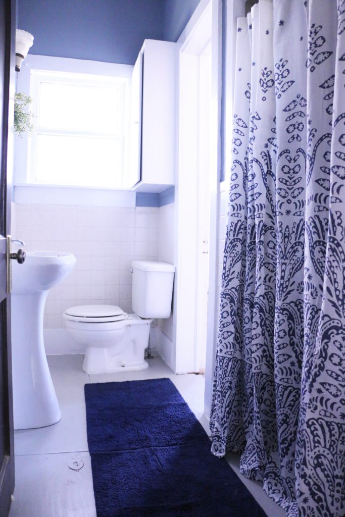
A shower curtain over the shower stall helps disguise that whole lotta ugly.

I also painted the plywood subfloor using some paint I had on hand. The floor is painted with Behr Tanglewood.

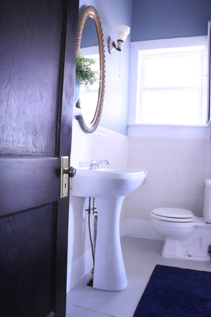
As you can see, I didn’t change any of the fixtures, the only thing I changed was paint. Isn’t that crazy?! Paint is so powerful!

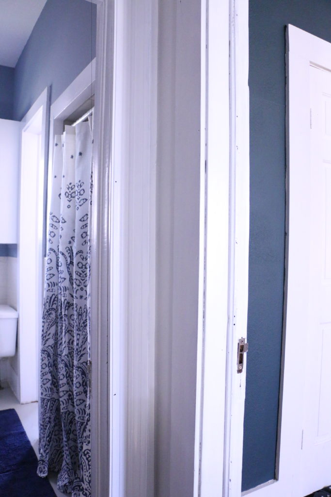
Because this room is directly next to our bedroom that’s painted such a bold color, I was really concerned about how these two colors would look when coming up the stairs and they were both visible. I think they go complement each other nicely. (Bedroom is Behr Thermal.)

The 1920’s light fixtures stayed, and I think they look so much more elegant now without the dated wallpaper.

All of this to say this: just don’t wait. I would have loathed this bathroom another two to three years until it finally was time to gut it. Instead, I can enjoy the space, and it doesn’t give me the heebee-jeebees every time I go in there! I think there is power in a can of paint, and so much power in doing a “Phase One” project, something that is just enough to tide you over while you’re waiting for the big project.

Before we go, here’s one more before and after from the same angle. I can’t even believe the only difference is paint.

Alright guys, that’s all for today. Have a fabulous day!