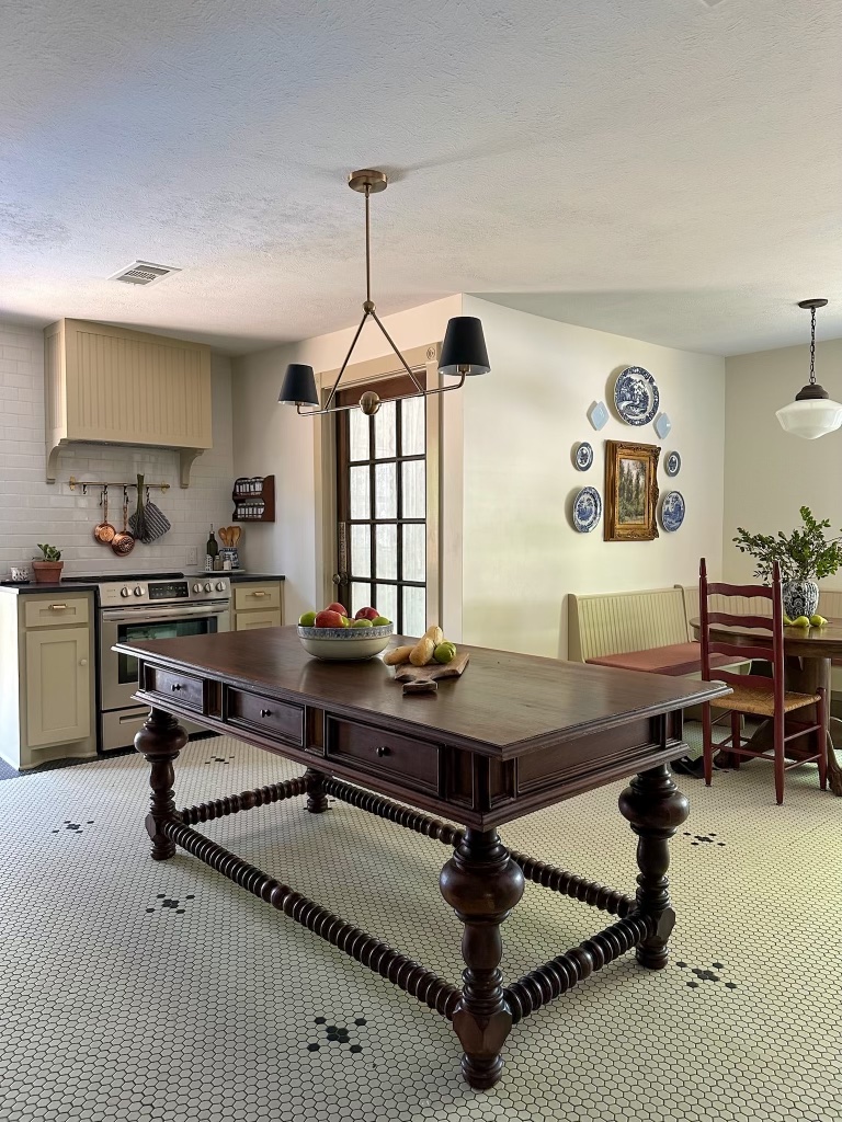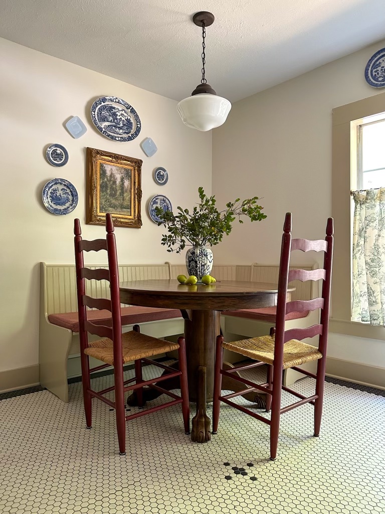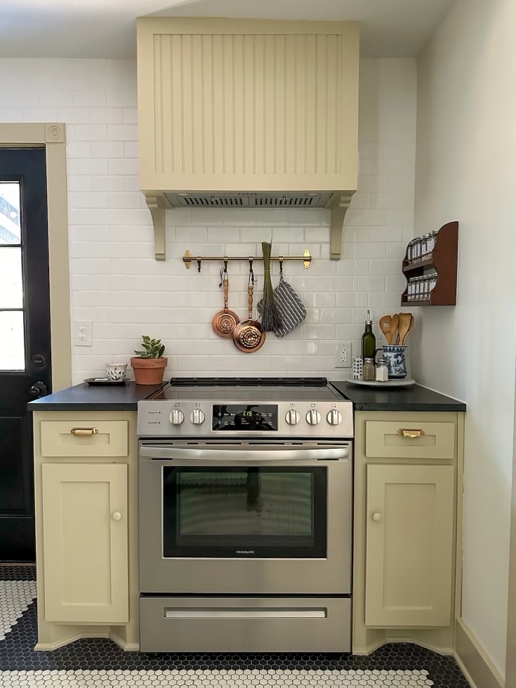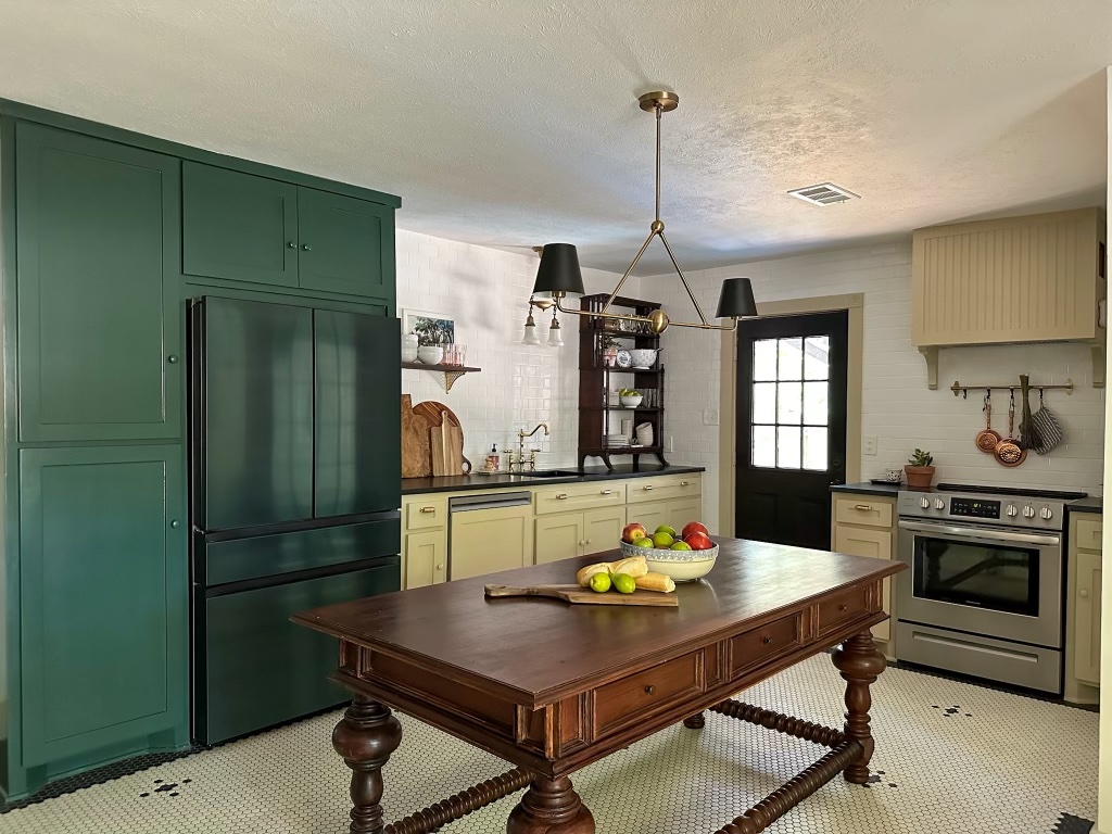
Can you believe it’s already 2025? Wild. This summer will be seven years in our house and I just now feel like we’re getting close to the end of the tunnel with projects we want to. Of course old home stewardship is ongoing in perpetuity, but there is a point at which I would consider our house “done enough” save for ongoing things, if that makes sense. This year we have a few large projects we plan to get done, and I wanted to share a bit more about my thought process for each one.
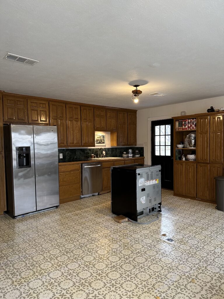
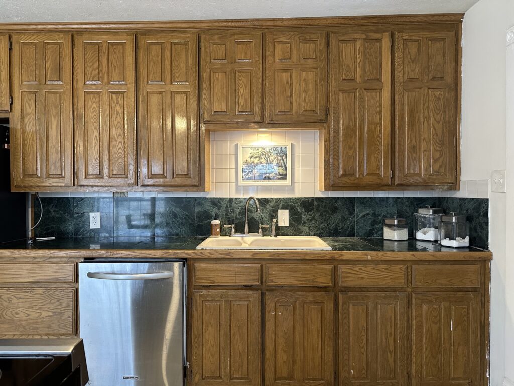
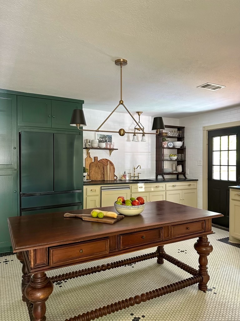
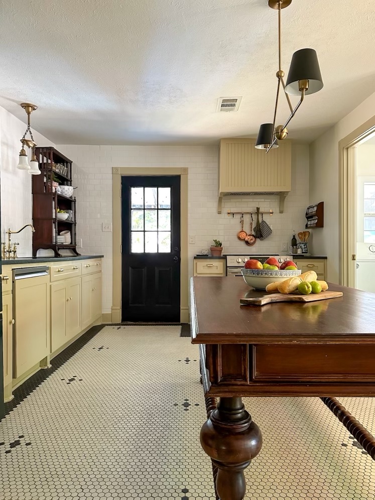
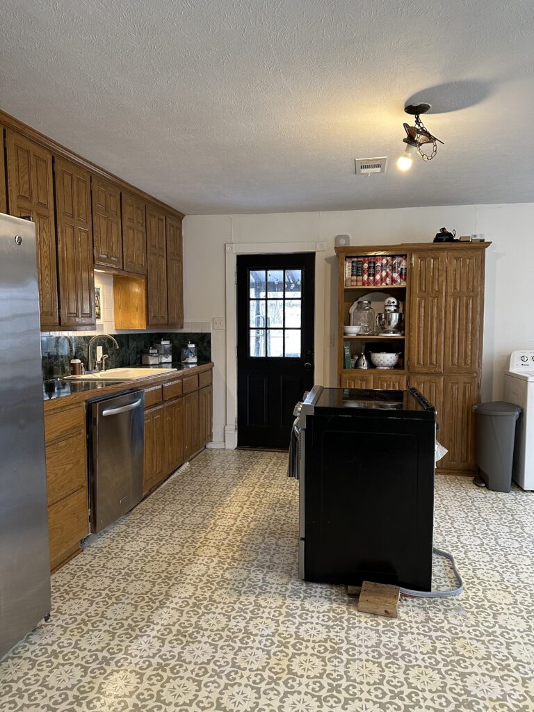
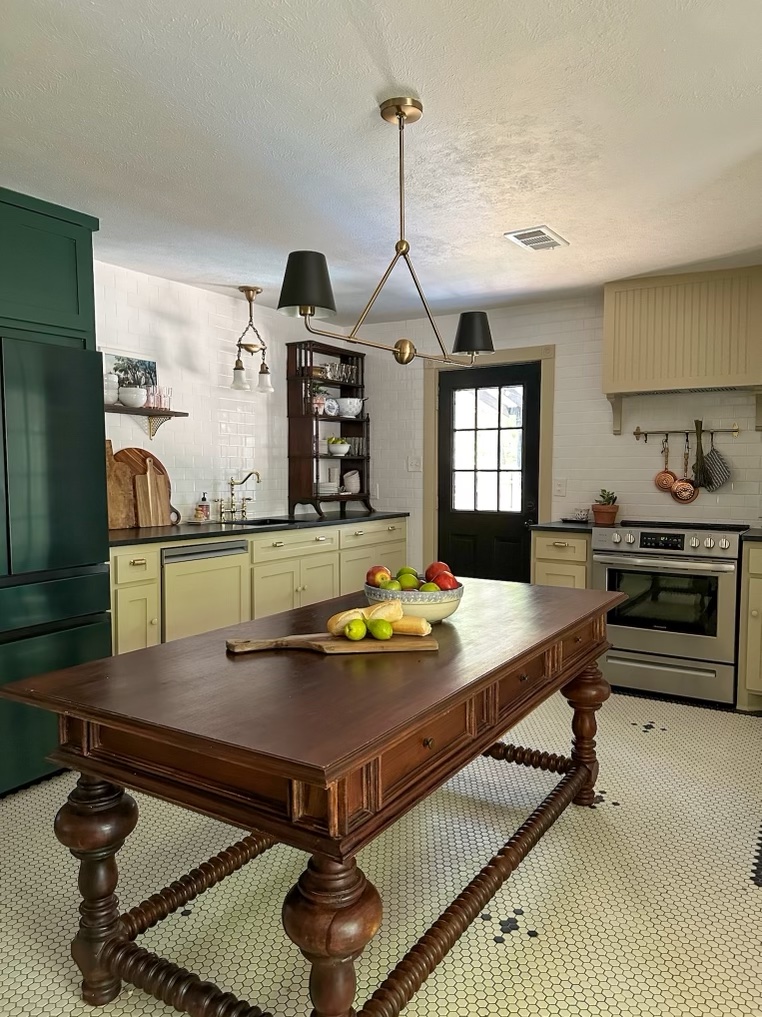
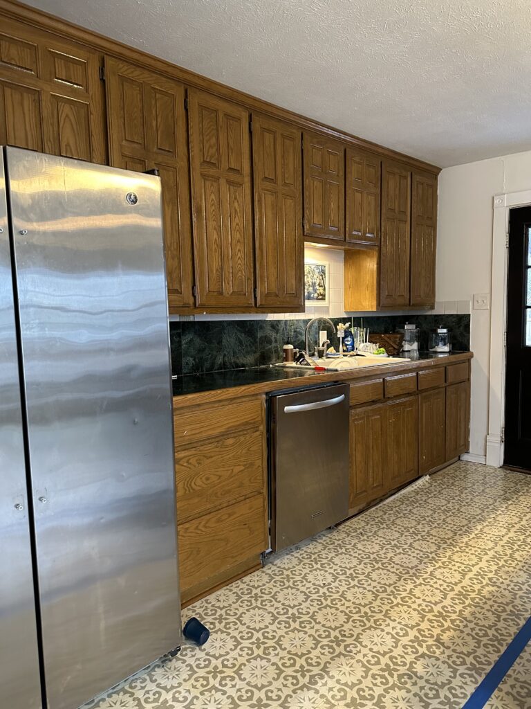
First, the one that we are currently working on is our living area. When we purchased the home, we did a lot of up front work to remove upholstery on the walls, tore out several layers of flooring and refinished the original wood, drywalled the room, but then we left it a blank space to come back to later. It’s been a white box for quite some time as other rooms have taken priority. This is the year of finshing our public spaces, and I am SO excited to get this room looking like an accurate representation of our home/family. For far too long it’s been a boring, uninspiring space.
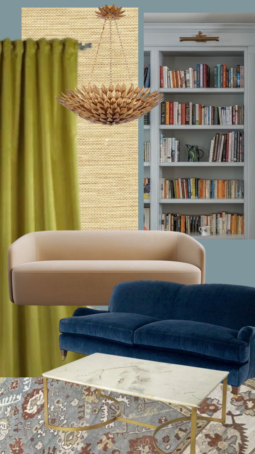
The vibe is very traditional chic, with all my favorite colorways. An homage to some of the house’s history with a modern update that suits us. Above is the moodboard for the space, with some items being exact representations of the items I own (the rug!), and others being placeholders for the style of item I’m looking for. Ethan is building an entire wall of built in bookshelves, and we’ll be painting everything a lovely blue color, and adding grasscloth wallpaper to the ceiling (!!!). A new light fixture, sconces, possibly upholstery, and drapery. The styling is going to be the fun part, and I can’t wait!
Immediately following the living room, we’ll be moving in the the front room which serves as our playroom/office/music room. It was originally the parlor of the home, and it’s used much the same way now as it was 100+ years ago. We’ll be bringing in some professionals to do some drywall and trimwork, as well as installing some new (salvaged) doors. Once that’s done, it’ll be easy work for me to turn the space into a moody office. I haven’t put together a visual moodboard just yet, but the plan is to have the walls a deep green with plaids and leather furniture. Like a dark academia/nautical/European library feel. If you can envision the vibe I’m talking about from that description, you are my people for sure. I hope to have both the living room and the playroom finished by this summer.
In tandem with the two inside projects that we will be working on, I am going to be overhauling some areas of our outdoor spaces as well. I’m not much of a gardener, but I’d really like to get into it. I’m planning some raised garden beds, and some hardscaping around it with pea gravel, etc. We have an inground fire pit we’ll be removing and replacing with sod, so our kids have more room to play in the back. I also have some longer term plans for removing a portion of our privacy fence and replacing it with a row of large bushes, but I’m not sure our kids are quite old enough to play without a fully fenced area, so that may have to wait. But is part of the long term vision! I’ll be spending time this spring and summer working on both inside and outside projects as time and weather allows.
And then for the fall, when our downstairs is completely finished…who knows? I could do anything at that point! Be sure to follow along on Instagram as I share lots of real time progress over there.
That’s all for today, friends. Have a fabulous day!