Room Tours

Shared Girl’s Room Reveal

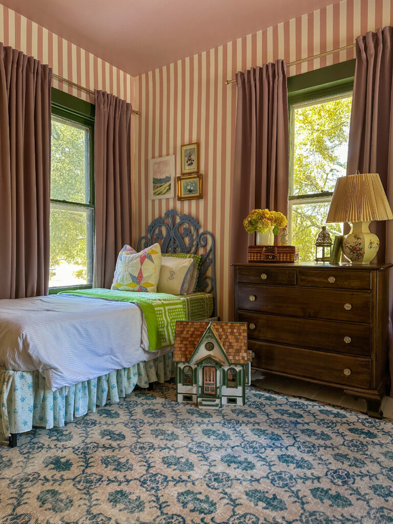
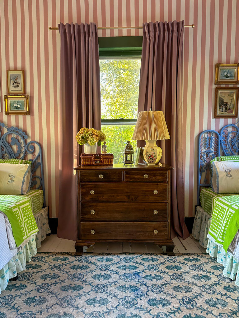
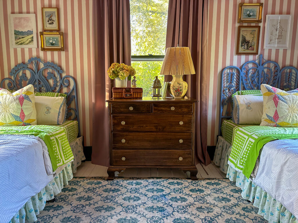
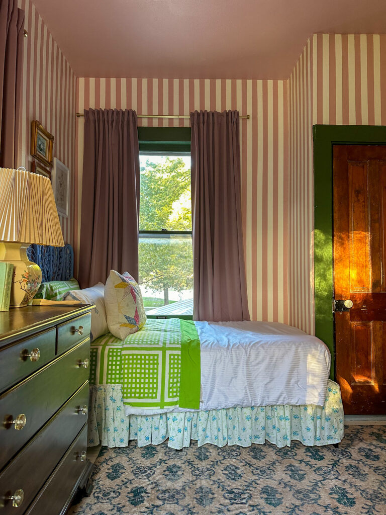
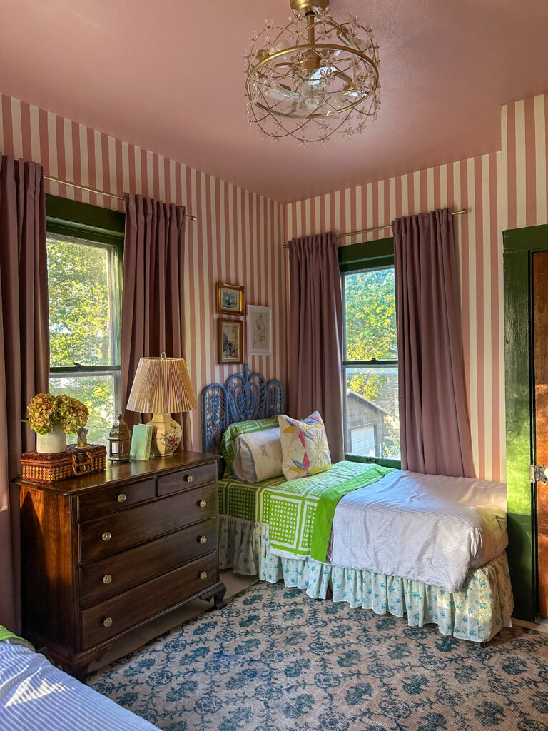
When you have multiple little kids in a home with fewer bedrooms than kids, those first few years entail a lot of room shuffling as babies need cribs, babies grow out of cribs, toddlers go from having their own room to sharing with a sibling, etc. Amidst our most recent and final round of room shuffling, we turned our no longer needed nursery into a room for both our girls. The brief from my four year old was pink, and green, and stripes.

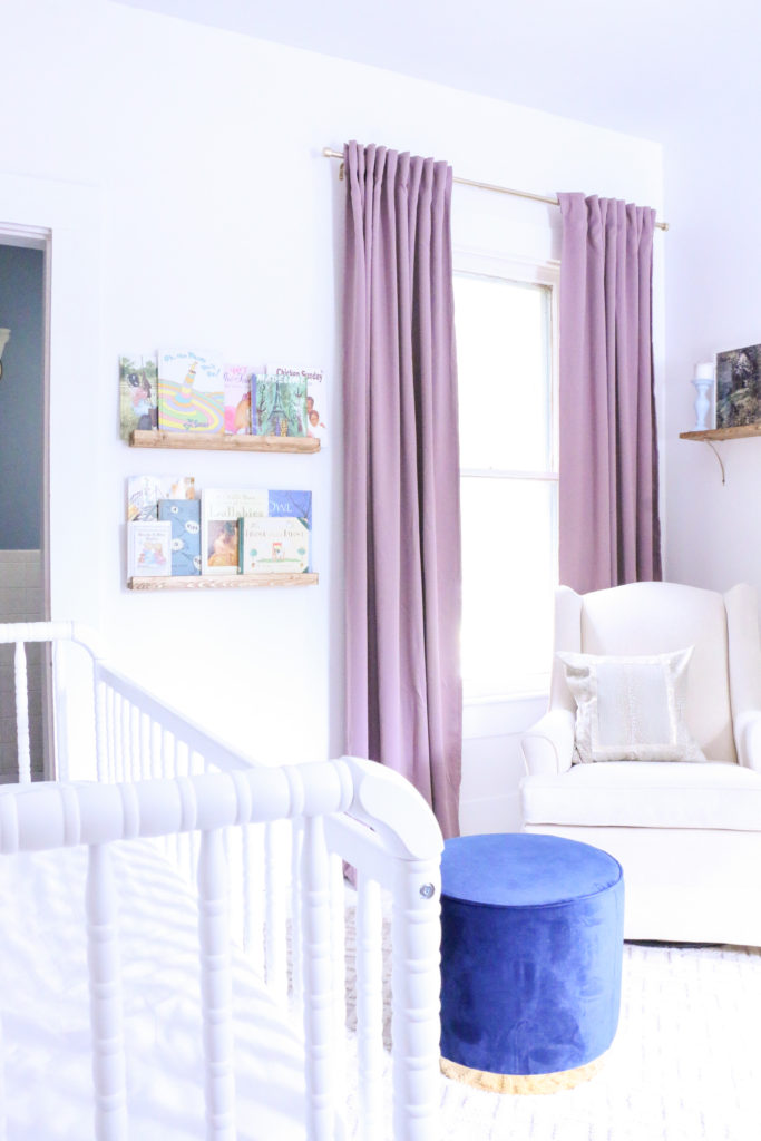
Now, I cannot pretend to tell you there’s any reason for this insane overexposed photo that I took in 2020, but that was the last time this room underwent a “makeover,” when we finished the nursery. Babies don’t keep, because just four short years and two baby girls later, this nursery is no longer needed.

As wildly bright as that photo is, it does serve as a good before photo to this dreamier, shared big girl space. Hard to believe this is the same angle.

I kept the curtains the same and refinished the dresser that had previously been painted (by me – we all make mistakes! When we know better, we do better!).

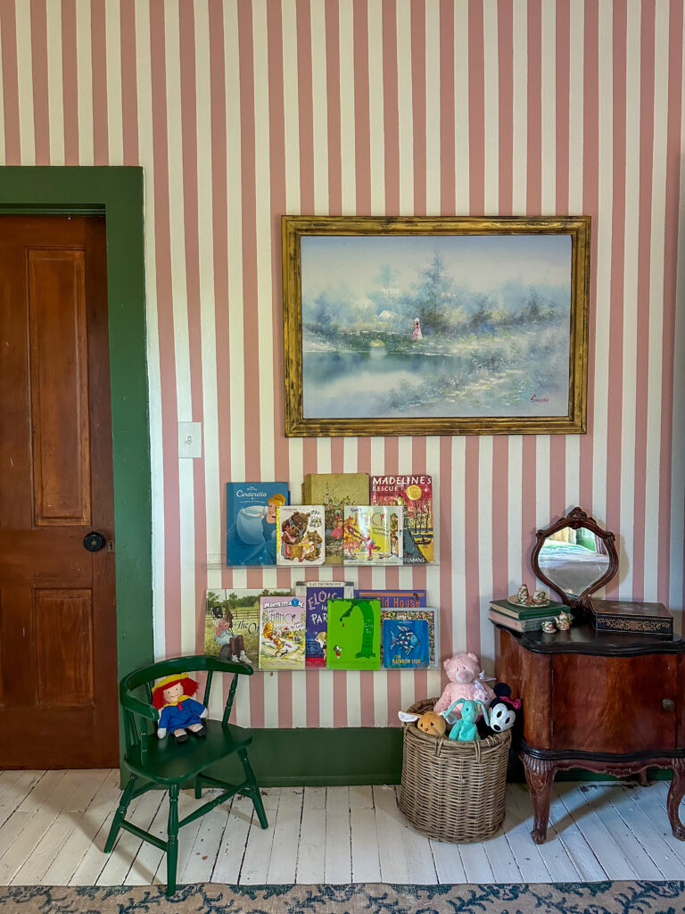
I handpainted the stripes on the walls using painter’s tape which was truly terrible and I would not recommend. Next time, I would just use wallpaper. The only upside is that I was able to choose exactly what colors I wanted. The walls are Behr Pink Quartz and Clare Timeless, and the trim is Behr Equestrian Green.

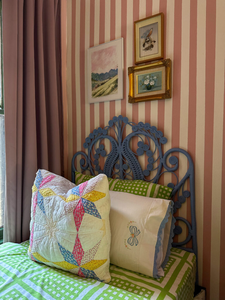
The linens are various vintage finds that I saved over time, the quilted pillows were made from a damaged quilt. The artwork above the beds was also all thrifted over time.

The vintage peacock headboards were found separately and were two different colors, so I painted them to match (Behr Mirror Lake), and I find the similar but different vibes of them to be endearing.

The room is pretty tight, and the only bed arrangement blocks all of the windows, but this room with windows on three sides already feels like a cozy little treehouse, and so the beds overlooking the trees feels fitting.

We previously had a ceiling fan in this room that actually got frequent use, due to the warmth of the room in the summer (see: windows on three separate sides, making it an all day sunshine spot). I hate the look of ceiling fans, but they are sometimes necessary, so we put in this “fandelier,” and have been very happy with it these past few months. And, if I can influence you to do anything in your home, let it be to paint your ceiling. You won’t regret it.

This was a really fun project to work on because it was dreamed up by my girls, and I was able to execute it in a way we all love. They proclaimed it to be “a real princess room now.” and I kind of agree. Hopefully these stripes last a long while, because I’m good on makeovers in this space for a good while.

Holidays

Free Fall Themed Downloadable Art

It may still technically be summer and 95 degrees every day, but there IS a chill in the air, and you can tell the weather is turning. Makes me want to start cozying up and making pumpkin muffins.

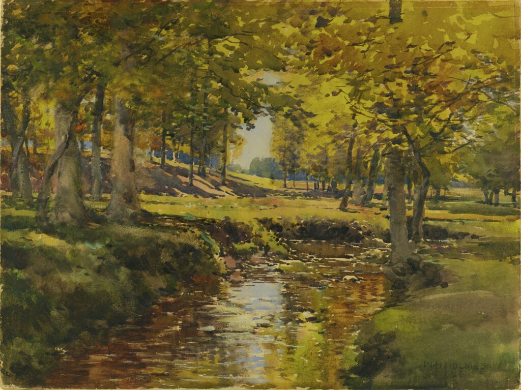
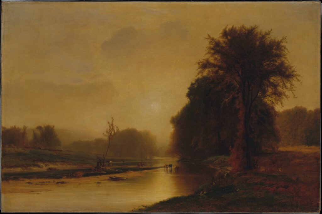
If you’re a person who likes to decorate for fall, I have something useful for you today! I gathered some free public domain artworks from various sources that you can use to print or display on your TV or computer monitor. Did you know many museums have publicly available art absolutely free on their websites for personal use? I feel like it’s the best kept secret. Don’t buy downloadable files, there’s so much available for free!

It can be slightly overwhelming to search through the thousands of available files, so I found a few today that are very autumnal in coloring and theme. If you need something, I got you covered! The link below each print will take you to the museum’s website where you can download a high resolution version of the print.

Autumn in the Meadow Edge

The Fall Season

The Great Horseshoe Fall, Niagara

Harvest Scene in the Delaware Valley

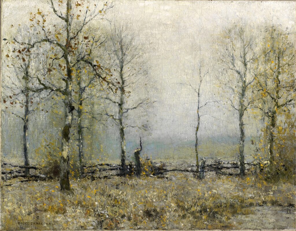
Autumn Meadows

Happy fall, and happy decorating!

Holidays

Holiday Gift Guides 2023: Shopping Small Businesses

The holidays are just around the corner! The busiest time of year and if you’re like me, I’m frantically making lists of the people to buy for. We try to be pretty intentional with the amount and types of gifts we buy around the holidays, especially with our kids, and fully support shopping second hand when possible. I even wrote a full post about it a few years ago!

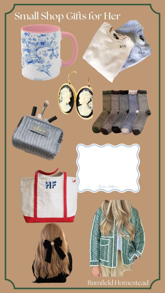
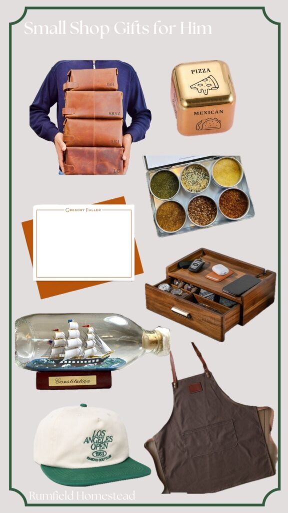
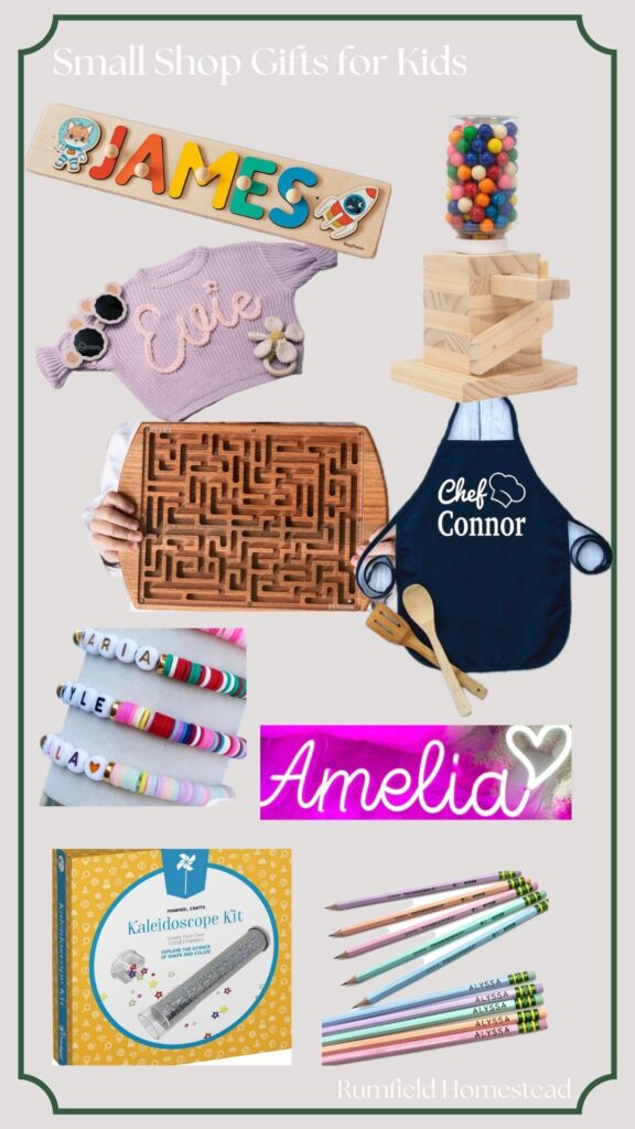
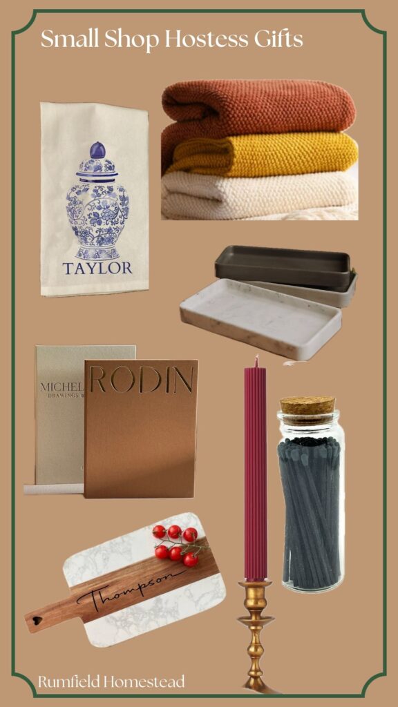
However, I know secondhand shopping isn’t always possible, so I wanted to come up with some ideas for the next best thing: small businesses. I gathered a bunch of ideas of things we have or have on our own lists. A lot of the items offered are customizable, which is such a thoughtful addition to any gift, in my opinion. So without further ado, my small business gift guides.

For Her:

Chinoiserie Mug – hello, this is my idea cup of tea. Monogram Sweatshirt – I love the subtle initial detail, it feels more elevated than the monograms of the last decade Cameo Earrings – need I say more? Wool Socks – I have reached the age where I’m actively asking for socks Custom Tote – this shop seems to have a sense of humor and is open to embroidering silly phrases on them. Mine might read, “mom stuff” or “brand name” Personalized Stationery – how darling is this? Vintage Style Bow – willing my hair to grow so I can rock this Quilted Jacket – On my list for forever! I love this green color!

For Him:

Leather Toiletry Bag – These are so clean looking! Food Order Dice – how funny is this? Good for a white elephant or a couple that struggle deciding what to eat each night (don’t ask me!) Personalized Stationary – comes in several color options! Gourmet Popcorn Seasonings – we love popcorn over here! Model Ship in a Bottle – what is the masculine urge to look at model ships like some kind of sixteenth century explorer? Ethan has one in his office, but I have to admit it IS cool. Accessory Box – keep ALL THE THINGS organized. Honestly men should just carry purses, it’s much easier. But this is the next best thing, I suppose. Vintage Style Golf Hat – So cool, right? Grilling Apron – it’s like an apron, but you know, for men.

For Kids:

https://rstyle.me/+jYsgU4yh_Ax6Iyy02asX1wPersonalized Name Puzzles – such a sweet gift for any baby to pre-school age kid Gumball Machine Kit – this is actually a set that you build yourself, my five year old would LOVE this. Name Sweaters – This shop carries these in sizes up to 5T Wooden Maze – this is such a cool gift idea! It’s also customizable on the back Name Apron – I bought these for my older two a few years ago, and my youngest is getting one this year. Such a great non-toy gift for kids who like to bake. Custom Friendship Bracelets – Elementary school age girls would love this! Neon Name Sign – imagine the cool kid status of a kid with a neon sign of their name in their room? I mean come on! Kaleidoscope Kit – this is a make it yourself set, which I love! Custom Pencils – would be a great stocking stuffer!

For Hosts/Teachers/Neighbors:

Custom Tea Towel – I had to throw some blue and white in here somewhere! Knit Throw Blanket – I don’t know about you, but I could always use another designated couch blanket Coffee Table Book Boxes – these are actually boxes to hide remotes and things in. I want some for myself! Concrete Tray – Pair with something homemade, and it’s an easy gift Personalized Cutting Board – I just love these for someone who loves to bake Beeswax Candles – the color options on this are lovely, and I love the ribbed detail Extra Long Matches – pair these elevated matches with a candle and it’s a super chic gift

House Progress

Our Kitchen Reveal!

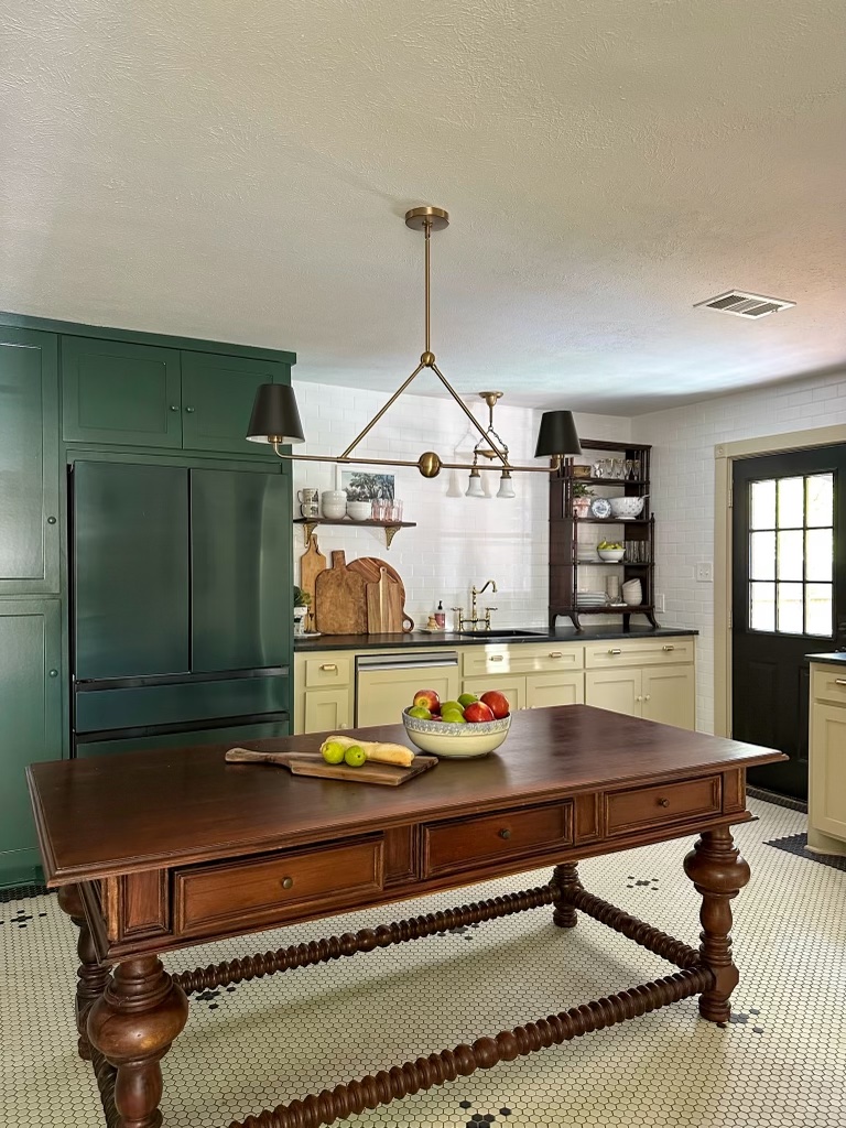
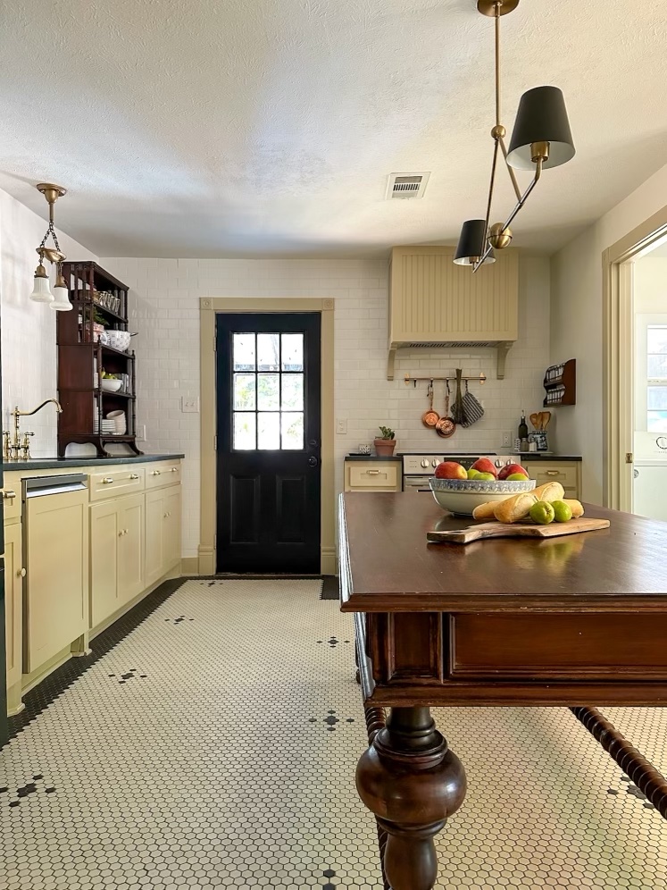
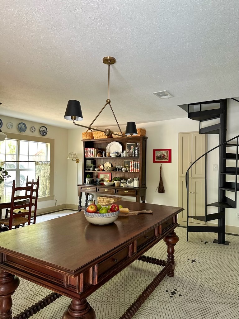
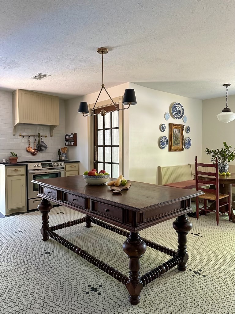
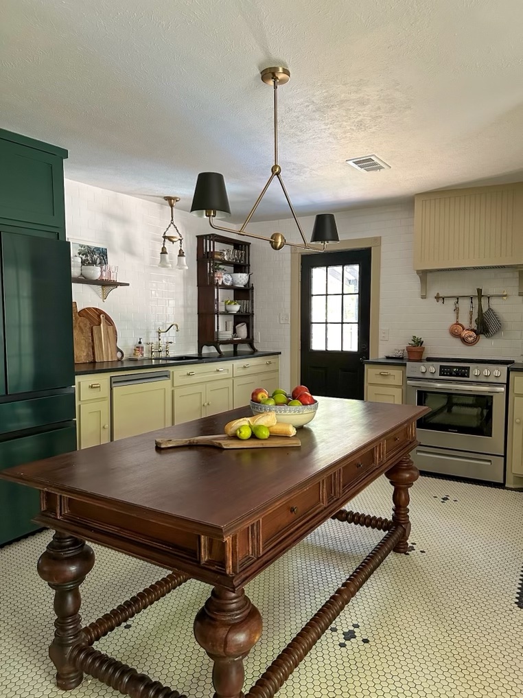
WOW WOW WOW I cannot believe it’s finally time to reveal the completed kitchen space with you all! It has been a long nine months since we first became aware of the water leak in our kitchen and began making a plan to renovate (more on that here).

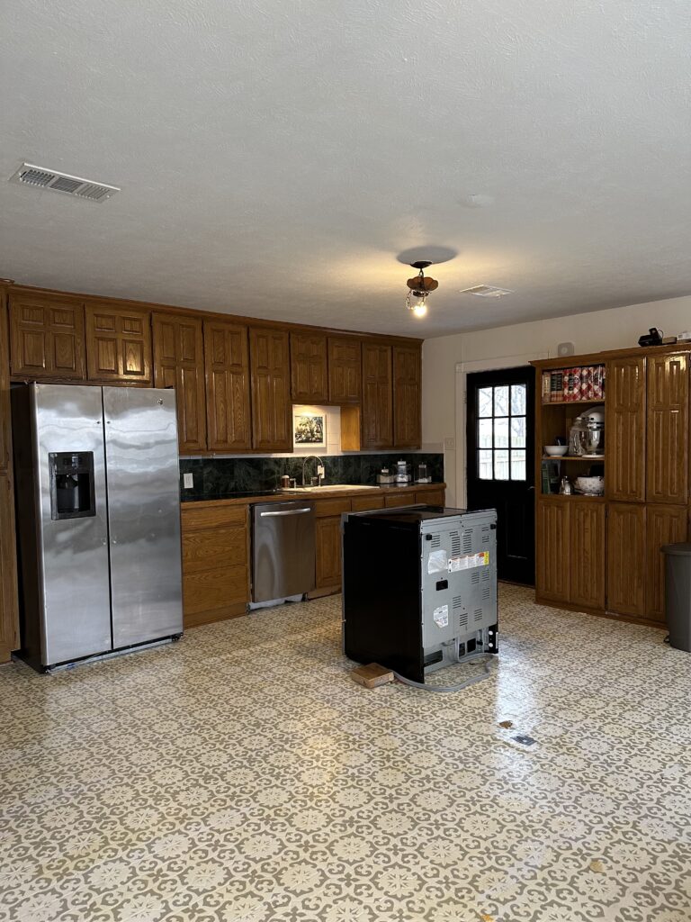
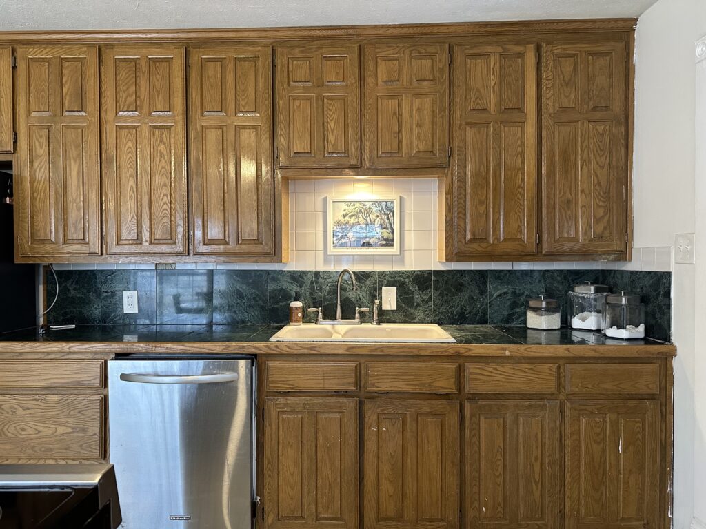
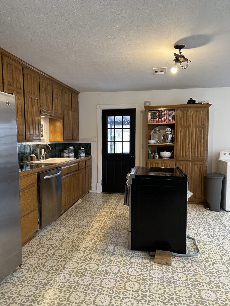
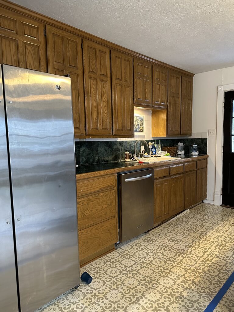
First, a quick walk down memory lane. These photos are so bizarre to me, after four years of living with this kitchen, it’s an unrecognizable room to me now.

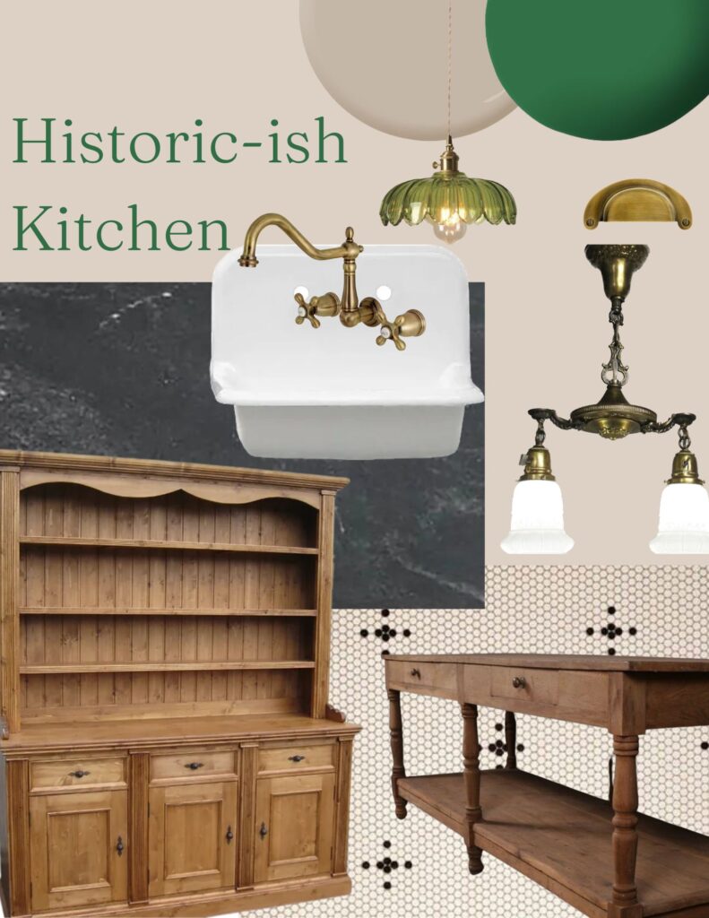
This was the original plan, I always find it helpful to put my ideas in one place so that I can get a visual of how everything is working together. Now that it’s done, it’s interesting to see how this compares to the reality!

I pulled inspiration from historic kitchens like The Elms in Newport, and Biltmore House in Asheville. I knew I wanted to nod to the history of our home c.1895, but obviously couldn’t take that too literally. I made tile selections based on what tile houses had at that time period, and salvaged antique light fixtures. I wanted it to be not a true “restoration,” but a historic-ish rehabilitation.

We worked with a contractor who we loved, and was willing to go above and beyond with some of our asks. The biggest thing was the flooring. I studied historic floor patterns, and fell in love with this particular pattern that of course doesn’t come pre-made. I also noted many Victorian-era homes the tile had a contrasting border that went around the room. We chose a one inch hexagon tile that came in 1x2ft sheets. We ordered in two separate colors, and the tile crew did an incredible job laying the black border, and then filling in the rest of the floor with white tile. I then carefully measured and counted where exactly I wanted each black tile motif and marked it with a pencil. The crew was so gracious to carefully remove each one inch tile that needed to be replaced and switch it with the correct color. It was a huge ask, and the whole thing took over a week, but I am so pleased with the result.

For reference, this is the same angle before!

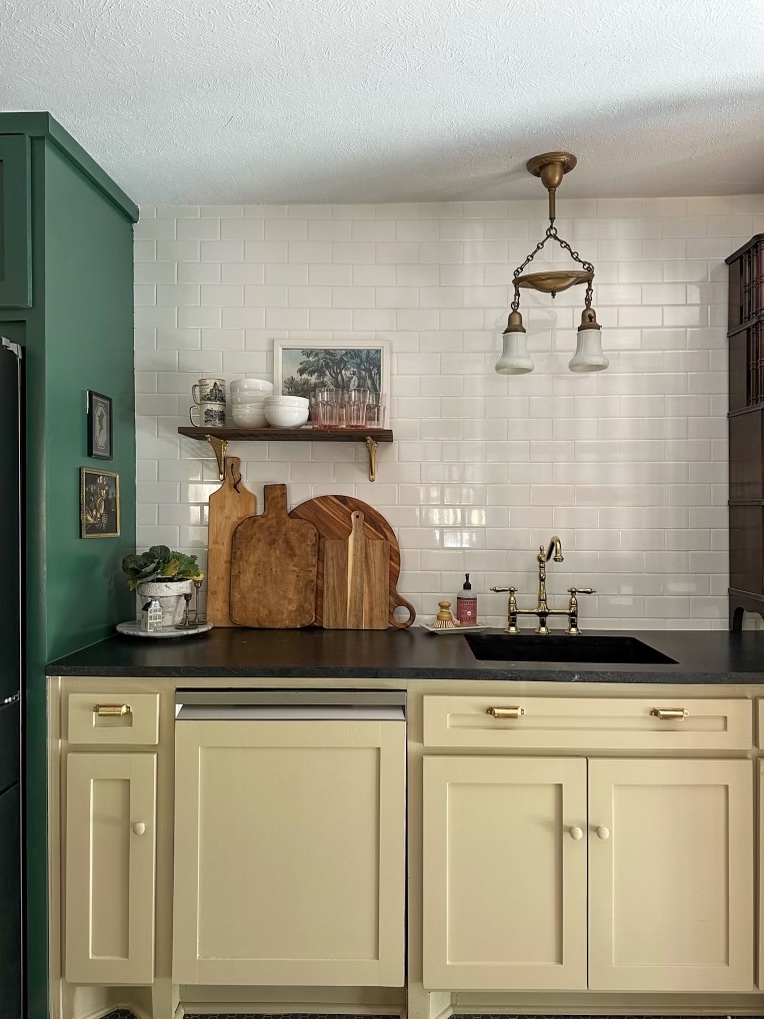
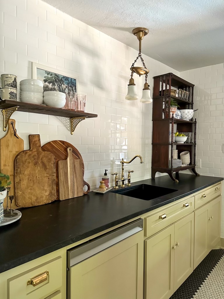
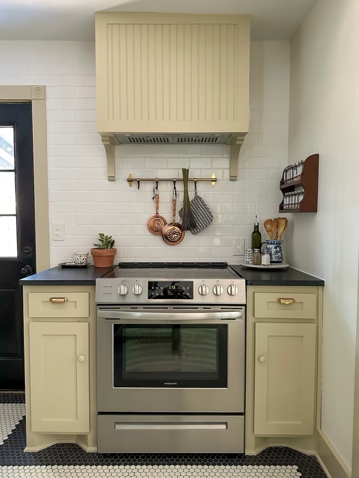
I thoughtfully decided to remove all of our upper cabinets so that we could run the tile all the way up to the ceiling. Traditional white subway tile is always a classic, no matter what trends come and go. With the addition of a bookshelf to store our daily dishes, one shelf made from a board from our home’s interior, and a large hutch with baskets, I have more storage now than I did previously with the row of cabinets up top.

I originally intended to use an antique sink, and I coulnd’t find one that met the specifics I needed, so I ended up ordering a simple black undermount sink, which I love. I think it makes the counter top (Negresco Granite, by the way, the poor man’s soapstone) longer since it doesn’t break it up visually, and it allows the gorgeous faucet to shine. A win-win!

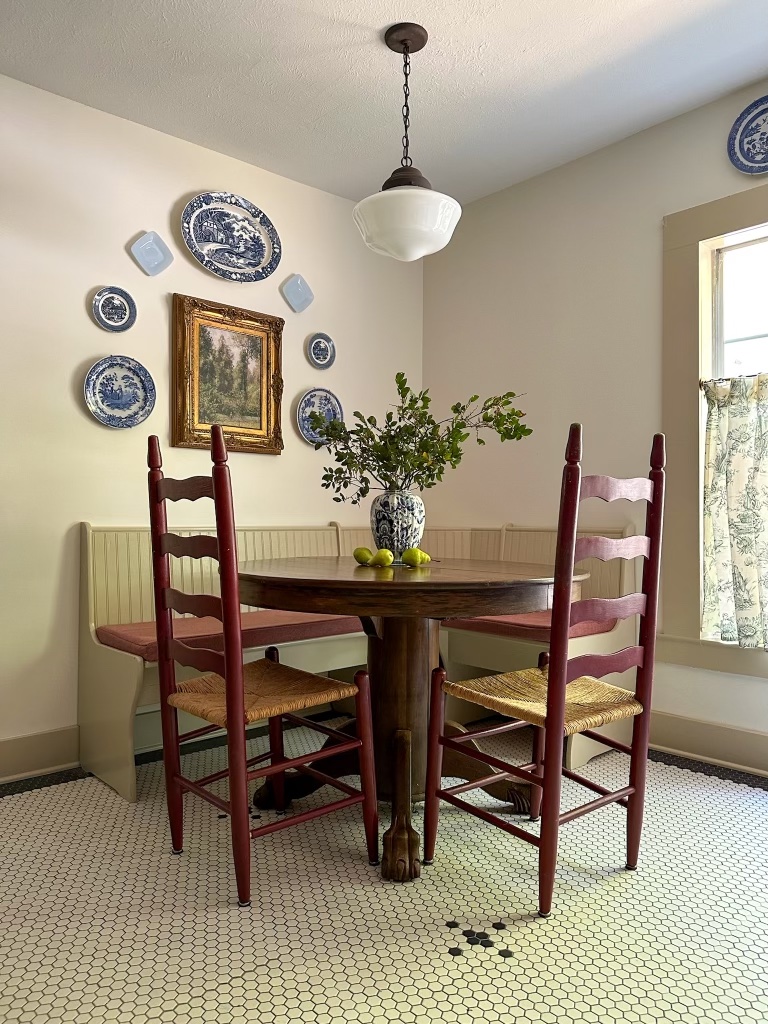
Although we technically lost square footage by closing in the laundry, it feels more spacious. With the closing in of the laundry room, I knew we would lose some light because we would be closing in two windows, so I wanted a door that would let some light pass through. I found a french door on my local buy nothing group, and it needed some work to make it shine, I stripped the paint and stained it to make it look and feel older. Lace curtains on the inside obstruct the view of the washer and dryer while still lighting the stove area. With the walled in laundry room, it also gave us a little alcove for a breakfast nook.

I found the bench and the chairs on Facebook Marketplace, and the table for sale on the side of the road in my neighborhood. It’s a high quality antique I bought for $20! I sewed some cushion covers myself, which I do not recommend if you want to keep your sanity, but was helpful in saving several hundred dollars.

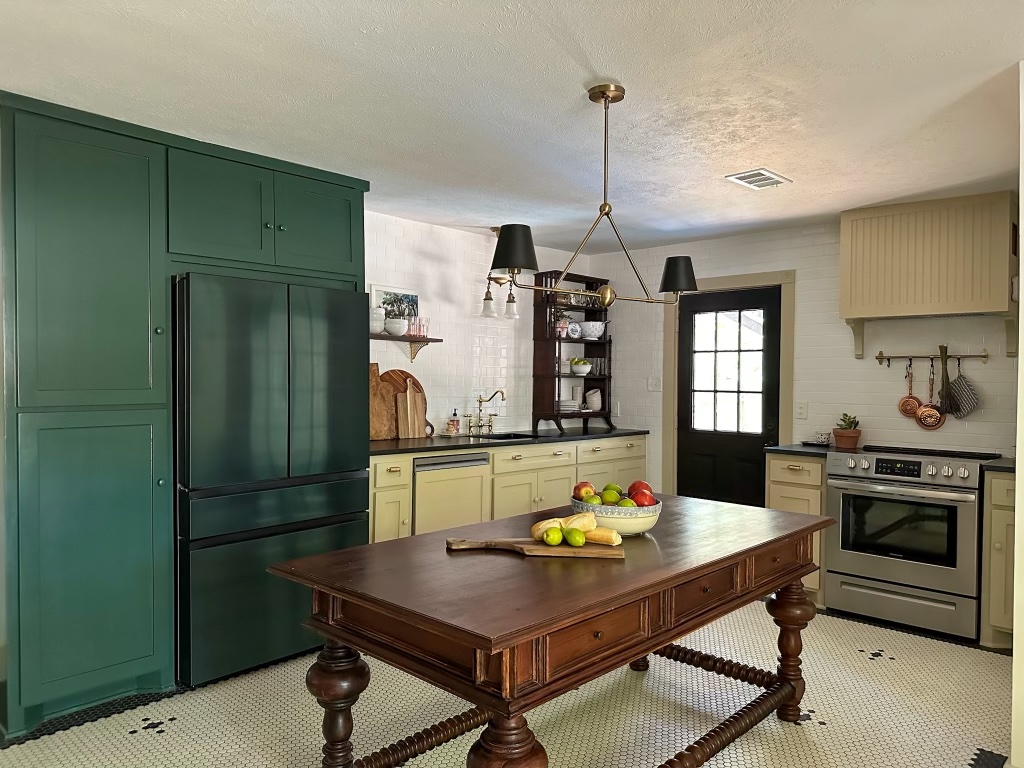
The only thing that was moved in the layout aside from building a wall around the laundry room was the stove. It works really well here, so I am happy with the decision to move it. Plus, it allows for our antique worktable in the center of the room. We purchased it at an antique store, and it is quite literally the most expensive piece of furniture I’ve ever purchased, but it was absolutely worth it. It helps bring a feeling of antiquity to the space.

We painted the pantry fridge cabinetry Sherwin Williams Billiard Green, to match the fridge. Which, by the way we love. It comes in several different colorways, and you can switch out the front panels to match your style. We also bought a dishwasher from the same line, but Ethan made the panel for it himself. We’ve had the fridge six months now and really like it (how’s that for an adult-sounding sentence?)

The paint color and all the trim and cabinets is Clare Turbinado, and the walls are Clare Timeless. I was super impressed with the coverage and love the colors! Of course I looked to historic house museum kitchens for color inspiration. Drawer pulls are these from House of Antique Hardware in unlaquered brass. They are already starting to get a slight patina as we’ve been using them, and they’re a nice solid quality. For the knobs I used simple wooden knobs and painted them to match. I also placed them about 1/3 of the way down the cabinet rather than in the corner, which I’ve seen in more English kitchen design.

I had grand plans of building my own replica of a light fixture for the island, and I eventually just ordered this one, and have no regrets. All the other light fixtures are antique or thrifted.

I really had this vision of an upstairs/downstairs vibe. Historically, “downstairs” would refer to workrooms, or servant’s living and working quarters in grand manors. Usually much simpler in their design than the upstairs public rooms. If you watch tv shows like Downton Abbey or The Gilded Age, you’ll notice this. I wanted to give a nod to the time period when kitchens were not the entertaining center that they are today but more the workhorse of the home, while mixing it with some glam that would have been reserved for the upper rooms. Hence upstairs/downstairs. It’s the mix of simple ladderback rush chairs with brass faucets.

This being the first kitchen I’ve ever done a single thing to, I learned a LOT. Made some compromises and didn’t get everything I wished I could have added (hello very normal budget), but I’m very proud of what we created. We are so so happy with it, and so so happy to be completely finished. It’s far and away the nicest room we have in our house now, which just means we have a lot more work to do.

That’s all for today, friends. Have a fabulous day!

House Progress

We’re Renovating Our Kitchen!

Eeek! I’ve been waiting four years to say those words out loud. And honestly I thought it would be a few more years before I did. We had plans to work on some rooms downstairs this year that would be smaller budget items.

But then a leak in the kitchen ruined the subfloor under our kitchen cabinets, and our plans changed. Due to extensive water damage, we are having to replace floors, cabinets, countertops, etc. So since a kitchen renovation was on the long term horizon anyway, we are diving in and going for it. It’s been pretty stressful up until this point, trying to work through finding the source of the water (it took three different specialists!), and trying to get contractor recommendations on an unplanned timeline. On top of things, our fridge died. It’s like the kitchen just decided it was her time to go, and she all went at once!

But now that we have wrapped our heads around the initial shock and urgency behind the situation, I’m getting excited about the design.

Our kitchen is currently a timestamp of the year 1997. The kitchen that was put in almost 30 years ago is dated, but I’m grateful to have had solid wood quality cabinets that have lasted. They’ve served us well until this point.

The only thing I did in this space was paint the floors before we moved in. I’m super excited to have the kitchen feel a bit more like the home it resides in, a Victorian built in 1895.

Of course we won’t have a truly period appropriate kitchen, we believe our home was built without plumbing, so there goes that, but I don’t want visitors to walk into the kitchen and be able to pinpoint an exact date. I’ll be using modern reproductions of historic materials, and adding free standing furniture pieces to contribute to an unfitted look. (Fitted kitchens where the cabinets are mounted to the wall were popularized in the mid twentieth century, whereas before that kitchens were a collection of different tables and shelving pieces.)

I plan to find salvaged and antique pieces to help contribute to the overall feel of the room, so although I have some photos listed below, they are general ideas and the actual execution will depend on what I’m able to find.

I’m calling it the historic-ish kitchen, because that’s just what it’ll be…ish. I’ll be sure to share updates here as things get rolling (demo is happening soon!), but if you want more up to date information, be sure to follow along on Instagram where I share much more in real time.

Now, I’ve got to get back to scrolling Facebook Marketplace incessantly in between planning the next antique store to check out, but I will keep you updated as soon as I have more! That’s all for today, friends! Have a wonderful day!

Holidays

Vintage Inspired Christmas Decor

Can you believe the holidays are already upon us? It seems to come faster every year. I know it’s a little early, but I’m already thinking about my holiday decor. I usually try to keep some kind of theme or color scheme throughout my decorations so I don’t get tired of the same things year after year. Plus, I enjoy creatively putting together a new arrangement.

This year, I’m going for all things “Grandma’s House.” If I can imagine it being present at my grandmother’s house, it’s in. I’m looking back at midcentrury family Christmas photos and drawing inspiration from them. My biggest triumph this year has been slowly collecting boxes of Shiny Brite ornaments throughout the year at estate sales. You know the ones: the simple colorful ball ornaments. And of course, lots and lots of icicle tinsel.

I gathered up some holiday decorations that give of the Grandma’s House vibe, in case you want that vintage look this year too, without the time commitment of searching high and low for authentic vintage pieces.

Icicle Tinsel – I think this is the biggest impact for that classic look!

Window Candles – I bought a set several years ago and have been so happy with them. The house looks so cozy every time we drive up in the evening. They are on a timer too, which is so nice!

String Light – I remember my Great Grandmother’s tree having the giant C9 bulb lights, and it would be so well lit, the whole tree was radiating heat. These are LED so you won’t have to worry about the fire hazard like the days of old, but there’s something so sentimental to me about the big old string lights.

Popcorn Garland – I strung my own popcorn string, and you can totally do that too, but if you have dogs or children prone to eating edible things off the tree, they make artificial popcorn garland! Consider my mind blown.

Santa Sweatshirt – I had to include this because it’s just so cute!

Ceramic Tabletop Tree – You know your Grandma had one of these!

Classic Ornaments – These are the closest I could find to that old style classic bulb ornament. They come in lots of colors, so with a good mix of colors, you might be able to trick the eye into thinking they’re older.

Nutcracker Serving Platter – Is it even Grandma’s House without a kitschy serving platter? So cute for cookies!

Mini Tinsel Tree – This would be so fun on a tabletop or in an office!

Snowman Blow Mold – I have seen old blow molds at flea markets and antique stores plenty of times, but I had no idea Home Depot still made them!

Christmas Tree Train – Last year, we went on a Christmas home tour, and one of the houses had a train around the tree. My son, who was three at the time was absolutely mesmerized. It’s so joyful for kids and adults, I think!

Needlepoint Stockings – and of course, it wouldn’t be a vintage style Christmas without needlepoint stockings! Now, if you don’t have the antiquated skill of needlepoint (me!), you can buy them! These come in a bunch of different patterns and you can have your family member’s name embroidered on it!

I hope you have fun decorating this year, and however you choose to decorate, it brings you that warm and sentimental feeling of Christmases gone by. That’s all for today, have a fabulous day!

House Progress

How Painting Our House Black Affected our Electricity Bill

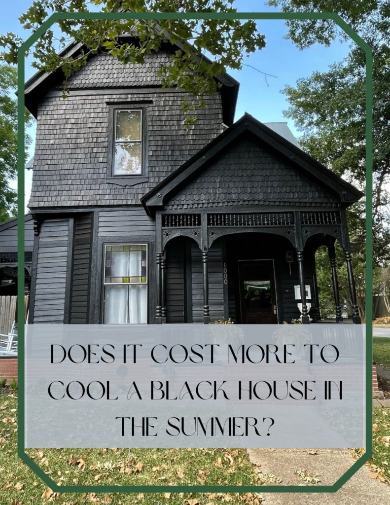
From the moment we uttered the words, “we’re planning on painting our house black,” the questions and comments started rolling in. “I would love to go dark, but our electricty bill would be outrageous!”You must live in a northern state where you don’t have hot summers.” “How high is your electricity bill going to be in the summer?” We took all of these things into account before we made our decision about painting the house black. We ultimately decided that it was worth it even if we ended up having to pay more for electricity in the summer. Texas summers can best be described as “hot as blazes for months on end,” so we definitely use our fair share of power in those hot summer months.

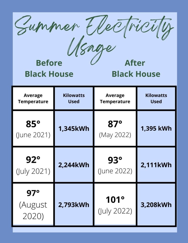
But I was curious. Even though we decided we didn’t care if we were using more energy, were we actually using more energy now that our house was black versus when the house was a pale yellow? I had to find out. I went back into the archives of our electricity bills and did some quick comparisons. This summer we’ve been dealing with record breaking heat, so I knew we would really be putting the black house to the test. Thankfully our electricity bill shows the average temperature that it was on any given month, so rather than doing a straight month to month comparison, I looked for months were the average temperature was as close to the same as possible. Unfortunately this year with our record breaking heat, I didn’t have quite an apples to apples comparison, but I still wanted to share the results of my findings.

You can see that in the first two side by side comparisons where the temperature was almost the same, the energy usage was relatively the same. The final month where our average was 101° we did use more kilowatts, but I think it is still pretty relative to the amount of kilowatts used during a month with an average temperature of 97°. So the short answer to the question of whether or not it’s costing us more to cool our house in the summer because our house is black is, nope. Not really.

Which is a welcome relief, seeing as how we had anticipated an increase and didn’t end up seeing one. But for anyone who might be considering painting their own house a dark color, I wanted to share our experience. I’m sure there are certain factors that would create differences, like how much shade your house gets (we have a lot of mature trees), or what direction it’s facing (ours is facing southwest) , or the quality of your insulation (ours is terrible). But this has been our experience, for what it’s worth.

I hope this was helpful to you, and maybe helps in your house painting decision making. Or, if you were just curious, now you know. That’s all for today friends, have a fabulous day!

Uncategorized

My Favorite Painting Supplies

I’m someone who paints a lot more than the average person. I just finished a room redesign in which the painting alone took sixteen days. What can I say, it was a very detailed paint job! (You can read about that room here.) I’ve now embarked on a mission to paint my entire garage which in the heat of summer is…fun. I feel like I live in paint clothes constantly and over time I’ve gathered so many supplies. I wanted to compile a list in one place of my most used basic paint supplies. Nothing fancy, just the stuff that I pull out of my garage every time I start a new job. So, here are a few things I recommend if you’re wanting to start on a new painting project!

  1. Wooster Shortcut paintbrushes – My most favorite item of all time! Comfortable to grip, and is the absolute best for cutting in along edges.
  2. Paint Brush Cover – These are awesome for saving a brush overnight if you plan to come back to the project the next day. My only complaint is that they aren’t compatible with the Wooster Shortcut handles.
  3. Roller Covers – a classic staple, I always like to have a few fresh ones on hand.
  4. Purdy Paint Brush – This is my go to for trim when I need a little height. The Wooster Shortcut is hard (for me) to cut in around ceilings and crown, so this one gives a little extra length
  5. Canvas Drop Cloth – Please protect your floors/furniture/grass…honestly these have so many uses I have so many of them and they really do work for everything!
  6. Paint Roller Tray – This is foundational to pouring your paint! You can use plastic liners with these, or wrap in tinfoil.
  7. Paint Roller Frame – Also pretty foundational to any wall painting job.
  8. Foam Roller Kit – This is useful for painting doors, cabinets, stenciling, anything you want a super smooth finish on.
  9. Extension Pole – Never ever ever paint without an extension pole. Even if the thing you’re painting is all within your reach, adding an extension pole to your roller frame will make it go so much faster, and will be so much easier on your arms.

Happy Painting! That’s all for today, have a fabulous day!

House Progress, Room Tours

Shared Toddler Room Reveal! – Spring One Room Challenge Week Eight

I cannot believe this room is finished! It’s been eight weeks of super intense working on making over my son’s room for my son and daughter to share. Their gender neutral, English country inspired room is just what I envisioned and I can’t believe it’s come to life! Or that I did 90% of it by myself! As a quick reminder before we dive into it, let’s just take a look back just eight short weeks ago:

Boring and basic, the floors had been refinished when we first moved in, and the walls painted white, but that was about it. The room itself didn’t have a “design.” Now, hold on to your hats people, because I cannot believe this is the same room.

We added the beadboard, chair rail, and picture rail ourselves, and I used a stencil that was generously gifted by Stencil Revolution to give the upper portion of the wall a faux wallpaper look. The green is Equestrian Green, the tan upper portion is called Windswept Leaves, and the stenciled color is called Split Rail, all by Behr. The walls alone really make the space and give it the antique, English, equestrian vibe I was going for. The white was necessary for a quick move in timeline, but it’s time it got some character.

The beds were my launching off point for the rest of the design. I found them on Facebook Marketplace almost a year ago, and I’ve been storing them in my garage until now. I bought them from a sweet retired couple who used them when their children were small. They had bought them at an antique store in the 1980’s, but they believed they were from the turn of the century. It was meant to be because so is our house!


Most of the art and decor was found secondhand at estate sales and thrift stores. I reused but reworked the curtains by adding blackout liners and drapery pins. The dresser is also the same dresser that was in here before, but it looks much more fitting now. More on the dresser in this post.

Dresser Before

The pillow shams were from a basic set, but I had them embroidered locally. I had a hard time finding someone who could do exactly what I was looking for, but the ladies at The Perfect Pair were so helpful and worked with me to get exactly the look I was hoping for. I think the monogrammed pillows give it a touch of class (as classy as two beds made up for toddlers can be).

The light fixture was a $50 Amazon find (I know!) which worked well to replace the old shadeless ceiling fan that was there with something that looked like a cute vintage light but came with the ease of modern wiring and installation.

Because most of my items were found secondhand, they aren’t linkable, but what I did purchase new is linked below.

Thank you so much for stopping by and checking out the kids new space. This is a room that I’m really proud of, and is something that I truly feel is a reflection of our home style. I worked on this solely during naptimes and after bedtimes for the last two months, and every time my oldest woke up, he would immediately go to “the new room” and check on the progress. Both of the kids love the space, and they can’t wait to spend their first night in the newly made over space. I wanted to make the room feel sophisticated but also fun and whimsy, and I’m so pleased with how it all came together.

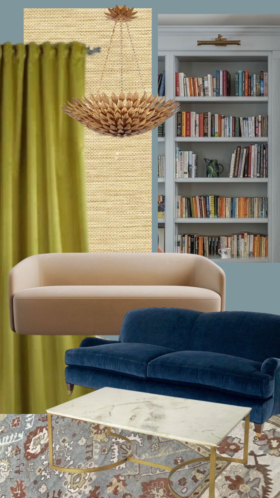
Now, remember this? This was the original moodboard for the design. I am so thrilled to see it in the flesh. It’s honestly the nicest room in our house now.

And last but not least, just one more for the road. I truly cannot believe this is the same room.

I would love to hear your thoughts! And after you’ve let me know what you think, be sure to go see some of the other great reveals happening today. That’s all for today, friends! Have a fabulous day!
Furniture Makeover

Spring One Room Challenge Week Six: How to Remove Veneer from Wood Furniture

Week One | Week Two | Week Three | Week Four | Week Five

Week Six already?! We are in the home stretch now and truly have the hardest work completely behind us now. This week I turned my attention to refinishing a dresser that was already in the room. You may remember it from the before photos.

This dresser was mine as a kid, and my mom’s before that. It’s been painted a countless number of times throughout my life, and the blue was just its most recent iteration. Several years ago, I attempted to strip it, but it was covered in a midcentury veneer style that I just didn’t love, and so I painted it again. I know a little more about furniture restoration and antiques than I did several years ago, so this time I decided the time was right to remove the veneer and see what was underneath.

I started out with a layer of SmartStrip. It’s a nontoxic paint stripper that cuts through multiple layers. I’ve only used it once before, but it’s what I had on hand, and it’s relatively safe for indoor use since there’s almost no odor, so I figured it was my best bet. I wrapped in plastic wrap and let it sit overnight.

Now, I expected it to take off the paint, but what I didn’t expect was for it to begin lifting the veneer as well. After about 24 hours, some of the veneer had begun to bubble. Which was a pleasant surprise for me, because my goal was to remove the veneer anyway. However, if you have a piece that has veneer you’d like to keep, SmartStrip is going to be too strong.

One coat of SmartStrip was enough to remove about 80% of the veneer! I saved myself a step of removing the paint first and then the veneer which is what I assumed I would have to do, but there was still some that needed another method to remove.

I used some old hand towels (they should be thicker than rags, but they will be ruined, so you want to use ones you don’t care about), and got them damp with the hottest water I could handle. I laid the damp towels over the veneer, and then set my iron on top of it.

It creates a ton of steam, which loosens the glue so that the veneer can be removed fairly easily with a putty knife.

I actually found this to be easier physically than scraping with the SmartStrip, but it was more time consuming.

Once I had all the veneer scraped off, I had to sand myself into oblivion. I sanded with an 80 grit, a 120 grit, and finally a 220 grit to make sure everything was super smooth. I then coated with a coat of polyurethane (water based because I was working on it indoors and didn’t want to deal with the odors). I did two coats of polyurethane, with a light sand with 220 grit sandpaper in between.

You can see in the photo above that I didn’t strip the paint from the bottom of the drawers, which if you look closely, you can see all the different color lives its lived. The purple was the color it was in my own baby nursery!
And now, it looks like the antique heirloom piece that it is! The pine looks so lovely in its natural state, and I am so glad I decided to leave it this color and not stain it. The hardware is the same hardware that was previously on it, but sporting a fresh coat of Rub N Buff in Antique Gold.
You’ll have to pardon the photo angle, I’m strategically hiding a few elements in the room I’m not ready to share yet. So you’ll have to check back for the full reveal in just two weeks to see how the dresser looks in its new home!

Be sure to check out the other participants’ weekly updates, and stay tuned, because the reveal will be here before you know it! That’s all for today, friends! Have a fabulous day!