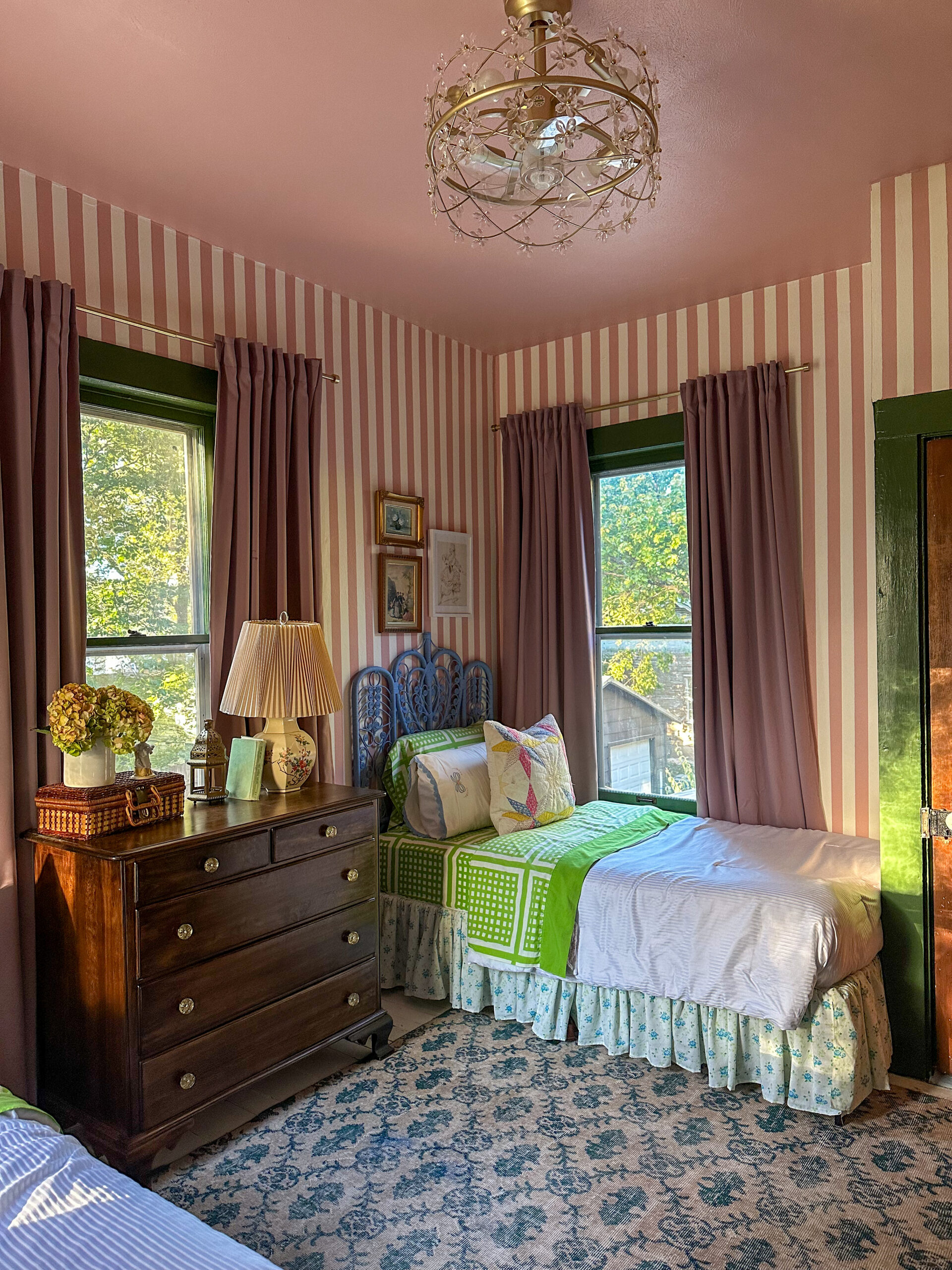
When you have multiple little kids in a home with fewer bedrooms than kids, those first few years entail a lot of room shuffling as babies need cribs, babies grow out of cribs, toddlers go from having their own room to sharing with a sibling, etc. Amidst our most recent and final round of room shuffling, we turned our no longer needed nursery into a room for both our girls. The brief from my four year old was pink, and green, and stripes.
Now, I cannot pretend to tell you there’s any reason for this insane overexposed photo that I took in 2020, but that was the last time this room underwent a “makeover,” when we finished the nursery. Babies don’t keep, because just four short years and two baby girls later, this nursery is no longer needed.
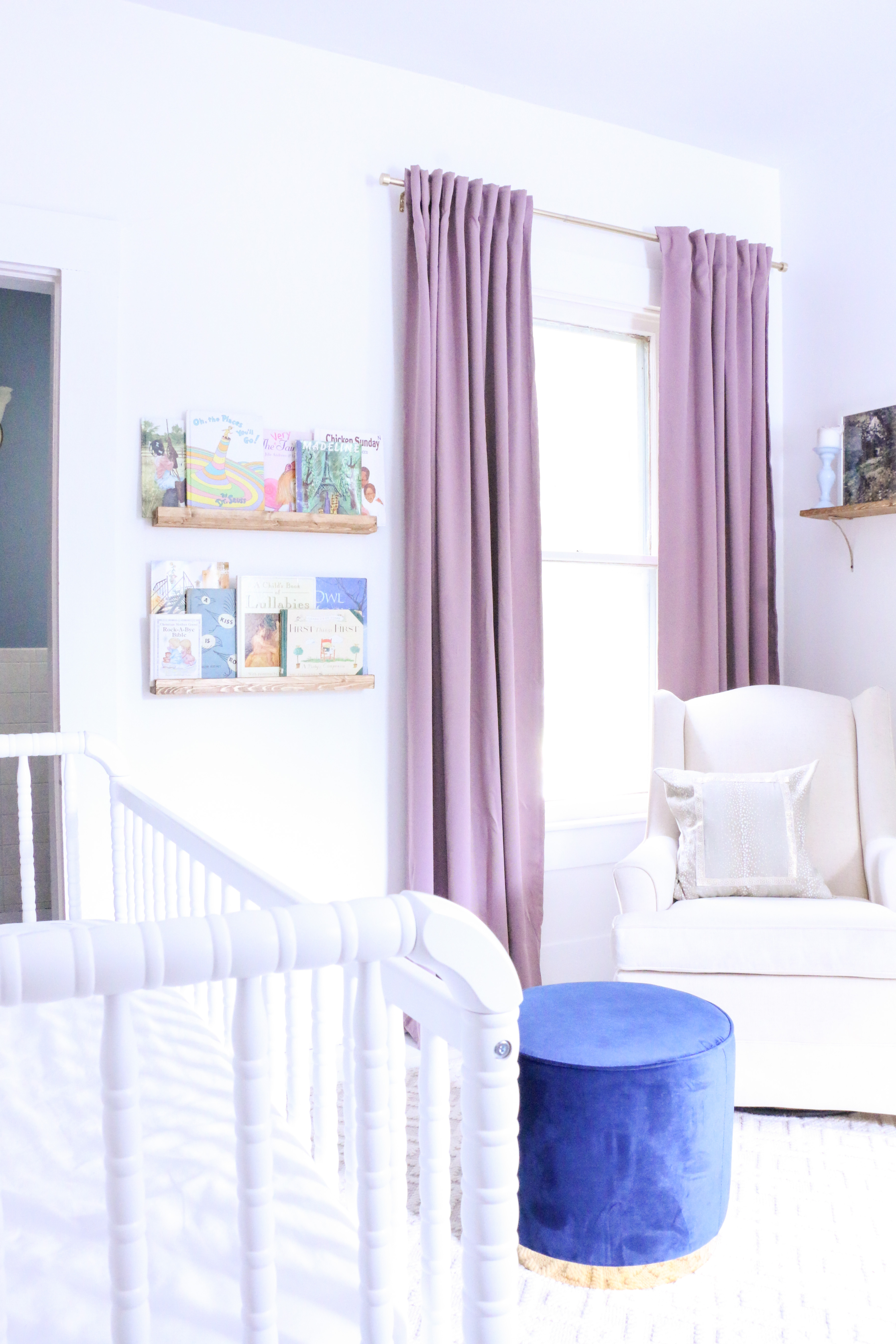
As wildly bright as that photo is, it does serve as a good before photo to this dreamier, shared big girl space. Hard to believe this is the same angle.
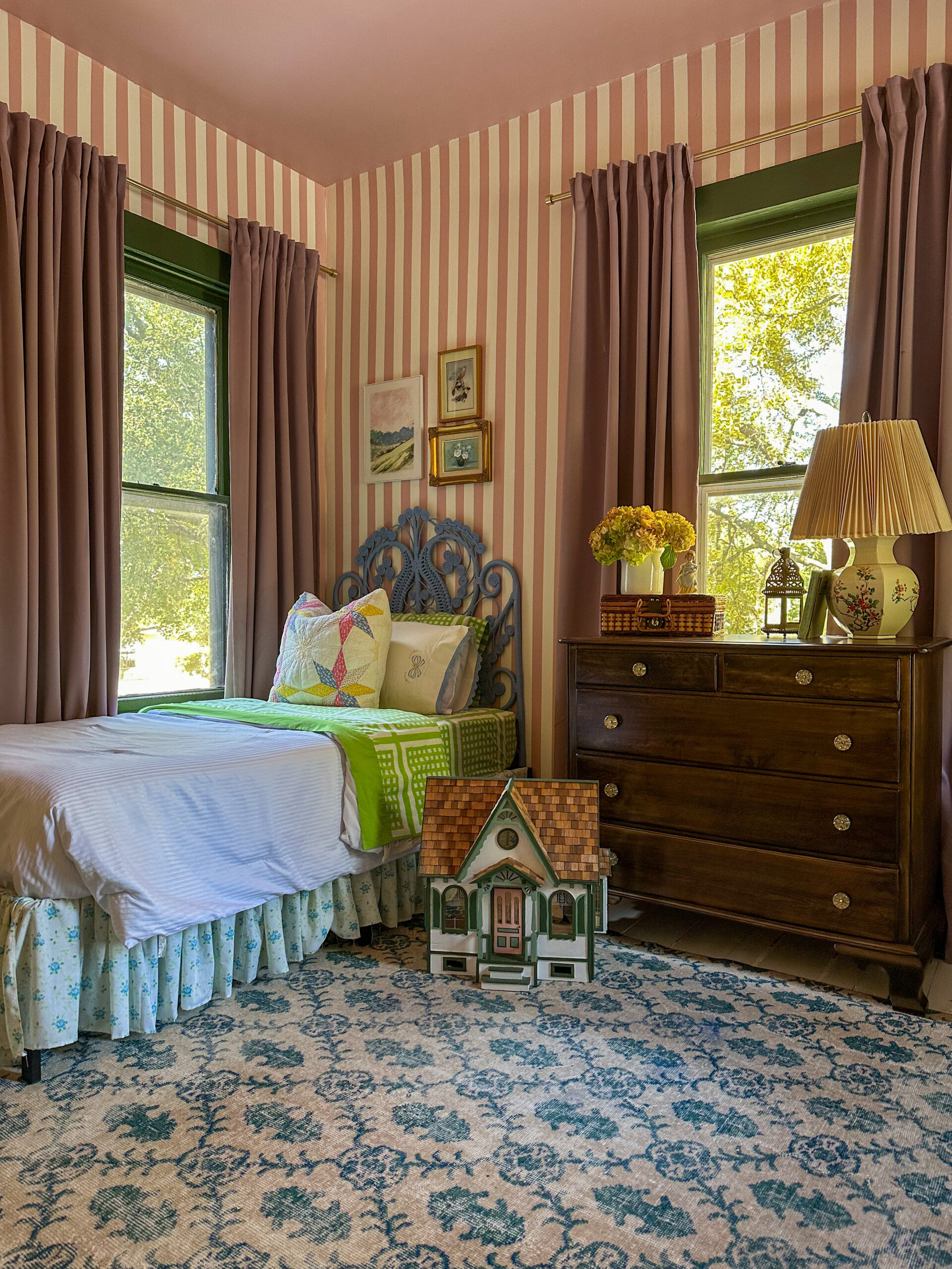
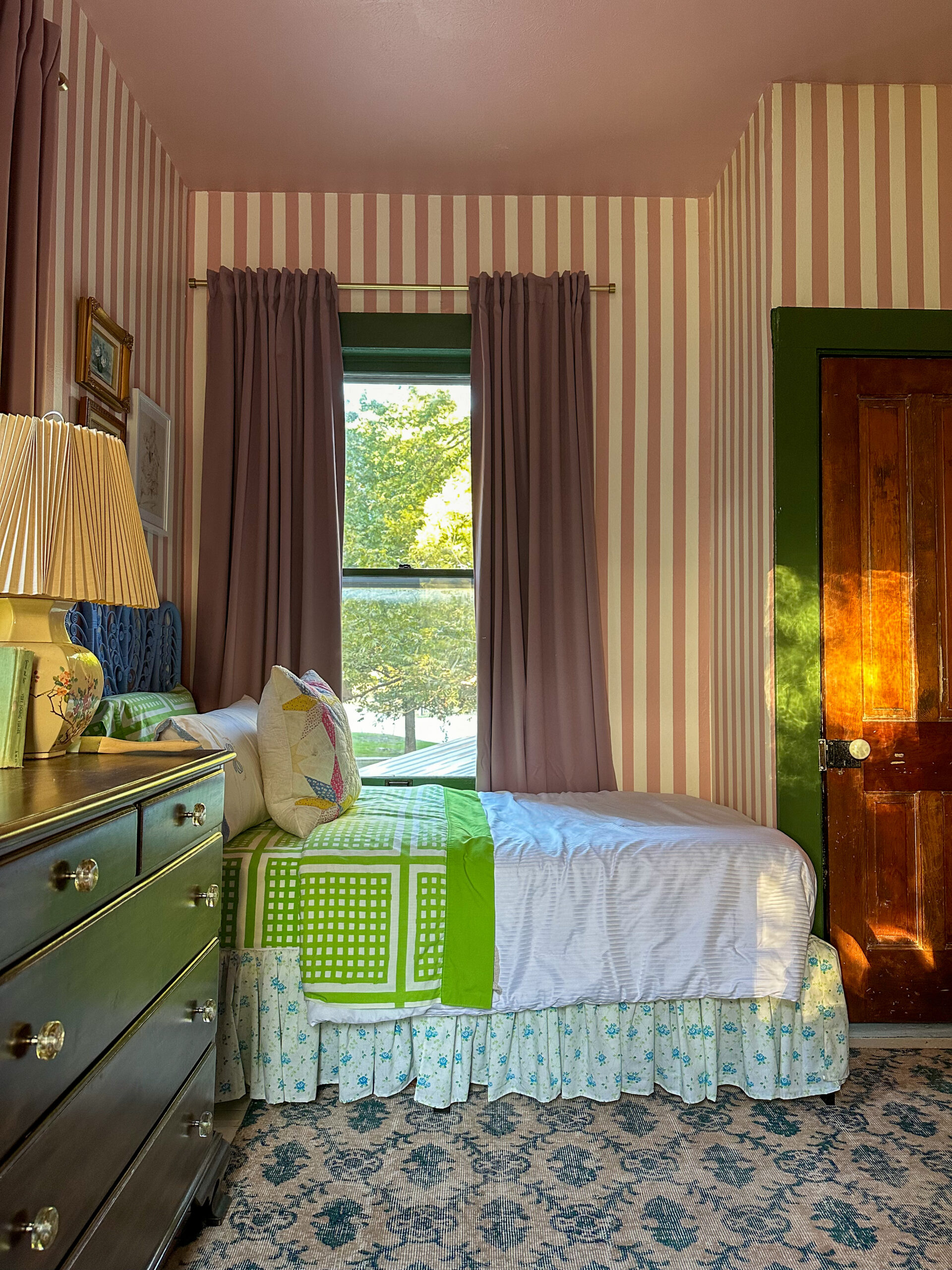
I kept the curtains the same and refinished the dresser that had previously been painted (by me – we all make mistakes! When we know better, we do better!).
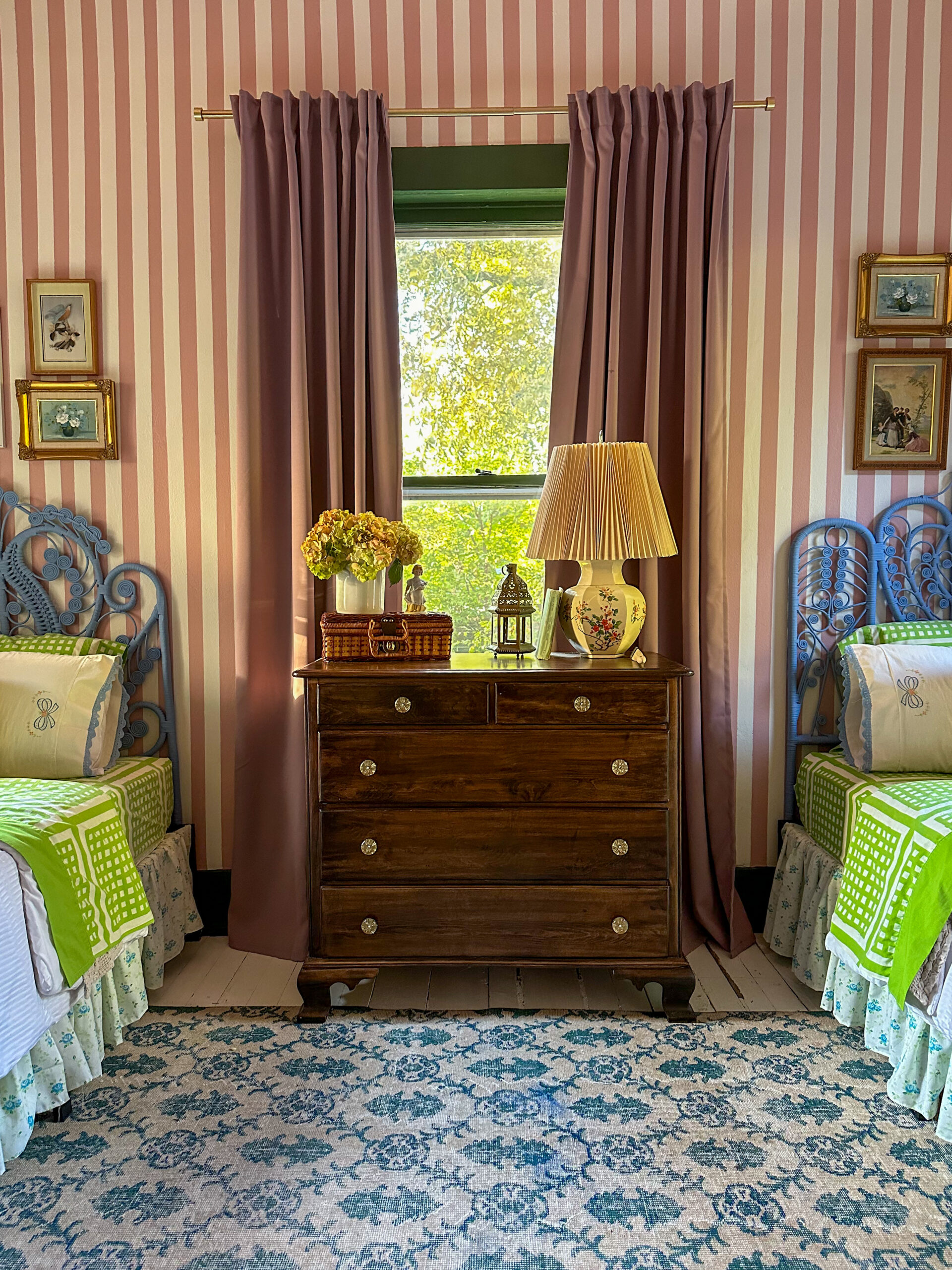
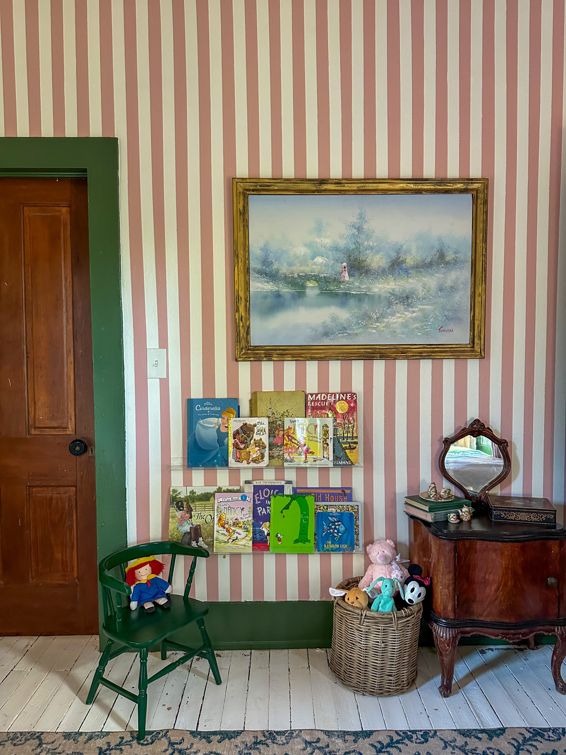
I handpainted the stripes on the walls using painter’s tape which was truly terrible and I would not recommend. Next time, I would just use wallpaper. The only upside is that I was able to choose exactly what colors I wanted. The walls are Behr Pink Quartz and Clare Timeless, and the trim is Behr Equestrian Green.
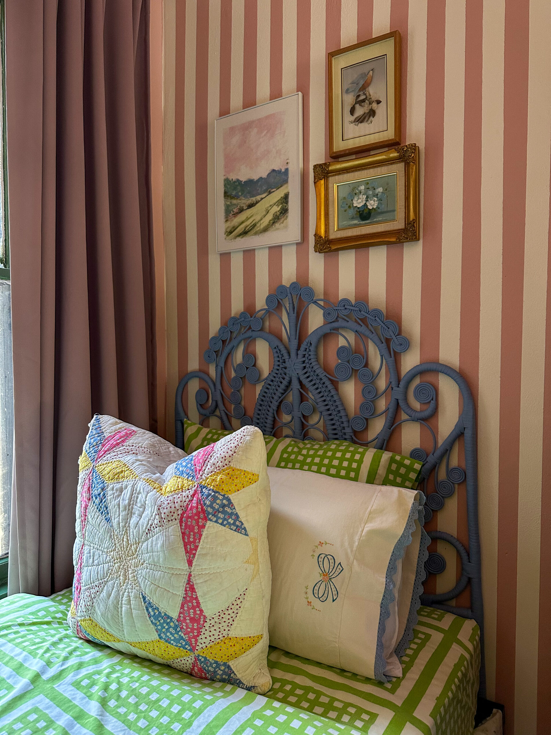
The linens are various vintage finds that I saved over time, the quilted pillows were made from a damaged quilt. The artwork above the beds was also all thrifted over time.
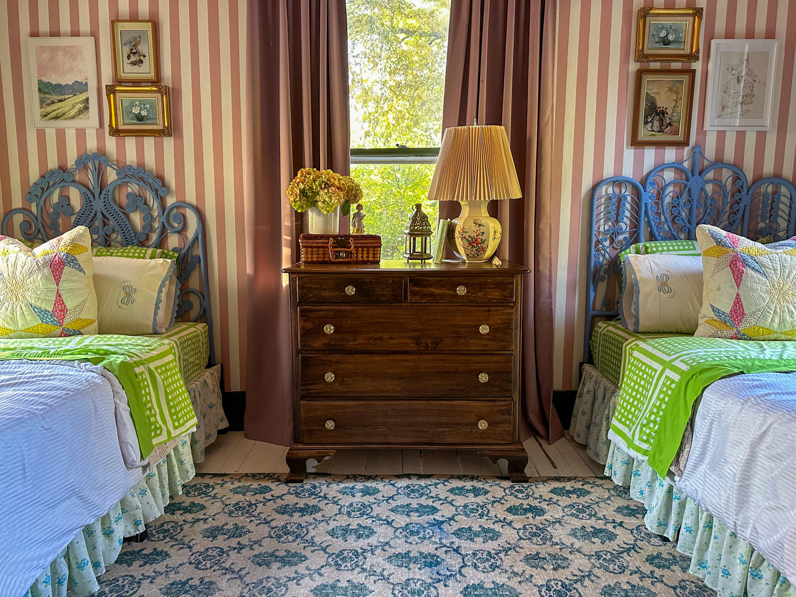
The vintage peacock headboards were found separately and were two different colors, so I painted them to match (Behr Mirror Lake), and I find the similar but different vibes of them to be endearing.
The room is pretty tight, and the only bed arrangement blocks all of the windows, but this room with windows on three sides already feels like a cozy little treehouse, and so the beds overlooking the trees feels fitting.
We previously had a ceiling fan in this room that actually got frequent use, due to the warmth of the room in the summer (see: windows on three separate sides, making it an all day sunshine spot). I hate the look of ceiling fans, but they are sometimes necessary, so we put in this “fandelier,” and have been very happy with it these past few months. And, if I can influence you to do anything in your home, let it be to paint your ceiling. You won’t regret it.
This was a really fun project to work on because it was dreamed up by my girls, and I was able to execute it in a way we all love. They proclaimed it to be “a real princess room now.” and I kind of agree. Hopefully these stripes last a long while, because I’m good on makeovers in this space for a good while.