I am so so so excited to show you today’s project. This one has me absolutely giddy. Y’all know this has been the year of the trash bag, aka I’m getting rid of everything and despising clutter. I’ve been thinking long and hard about what “clutter” even is, and sometimes I think it can be anything that isn’t pleasing to the eye. Even if it’s necessary. So then the dillema becomes how do I get rid of the clutter if it’s necessary? Today I want to share with you some simple things I did in my living room that make everything look SO MUCH neater and cleaner and just all around better.
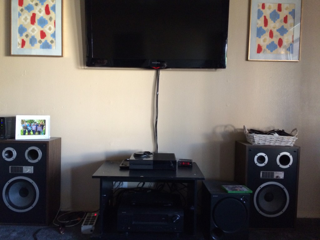
So Ethan is a media guy. He loves sound, and “equipment” is important to him. If it were up to me, I’d be listening to the TV sound from the speakers that are built into the TV. But apparently, my poor untrained ears don’t even know how awful that is. Needless to say, the large speakers and subwoofer weren’t going anywhere. Don’t know what a subwoofer is? You’re not alone. I didn’t either until I met my husband. Marriage is compromise people. But you can at least make the compromise pretty. First, let me show you what sort of equipment we were dealing with here.
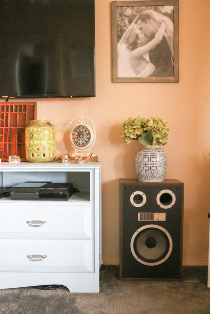
See how I tried to make it pretty with a vase on top? I wasn’t fooling anyone.
The media dresser was a project I completed a long time ago, pre-blog, when we first got married. It’s helping the situation, but in about the same way that a bandaid helps a broken arm.
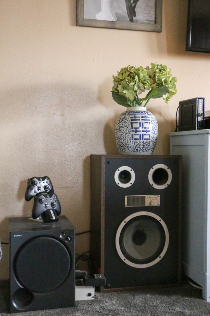
This side is the worst of all. (That on the left is the subwoofer, by the way. It’s the bass of speaker sound. Or something like that.) The power strip, the X-box controlers, all of it.
We tossed around the idea of building a completely new unit that would fit the speakers into it, but ultimately decided against it for two reasons. First, it would end up being extremely long were it long enough to keep the storage we currently had in the drawers and hold the excess equipment. Knowing this house is not our permanent home (thankfully), we didn’t want something so long that its use would be limited in another house. Second, the cost would be higher to build something new entirely than to fix what we already had. So, you know me. I was on a mission to DIY the heck out of this thing.
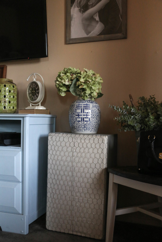
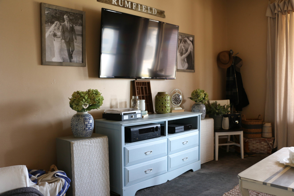
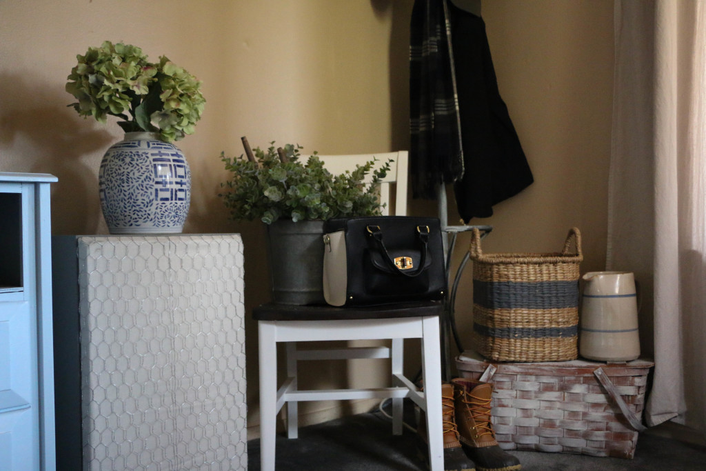
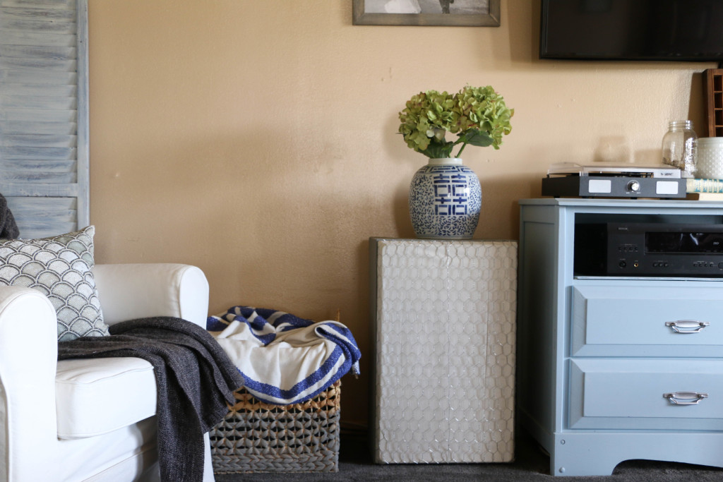
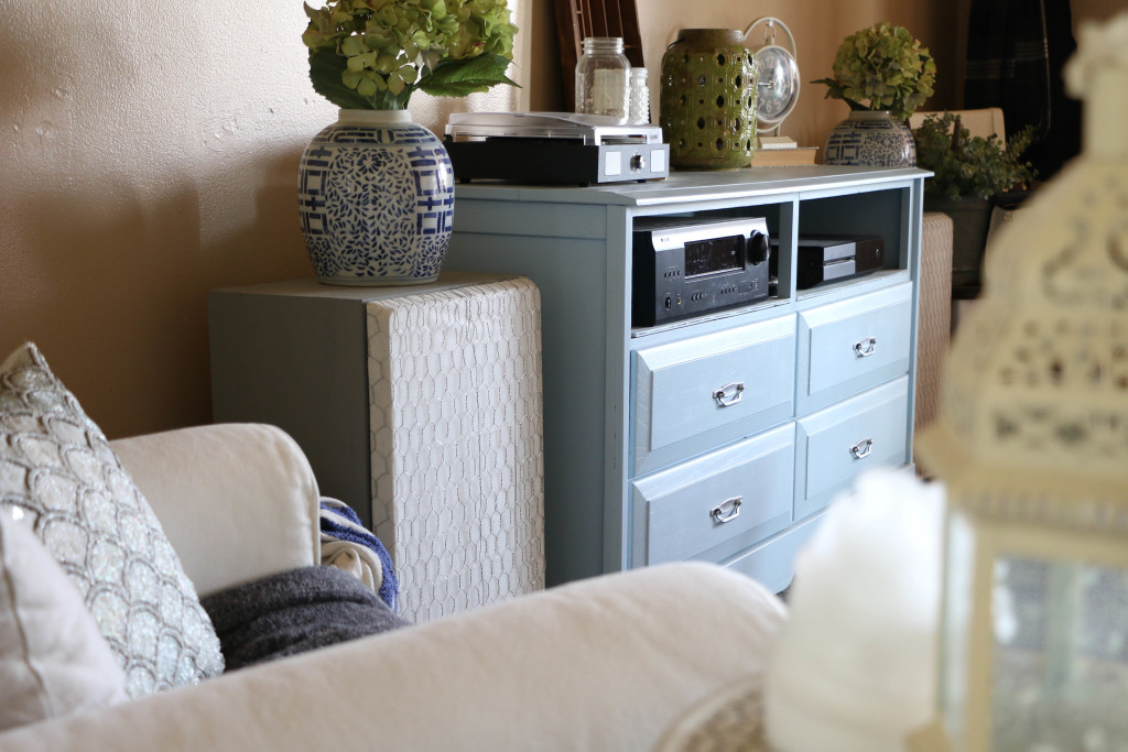
Here’s a closeup of one of the speakers when I finished it. Using the old coverings for the speakers (they were not pictured in the original photo, but luckily we had them stored in a closet), I tore off the old black material. I recovered the frames with a cream colored muslin. With my 40% off coupon at Hobby Lobby, it cost me under two dollars. I then added chicken wire over that just to add some texture. The chicken wire cost about six dollars at Home Depot, bringing my project up to a grand total of eight dollars.
The sides of the speakers got a coat of gray chalk paint. The paint was a new-to-me brand from a local shop, and I really liked the way it turned out. Goodbye dark wood veneer!
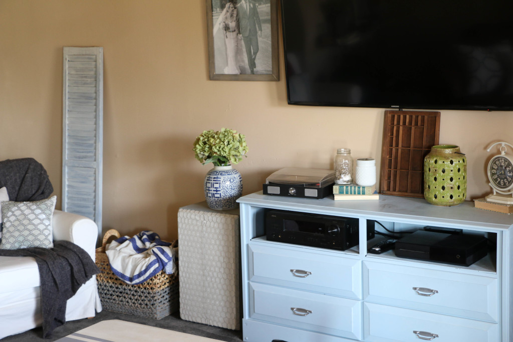
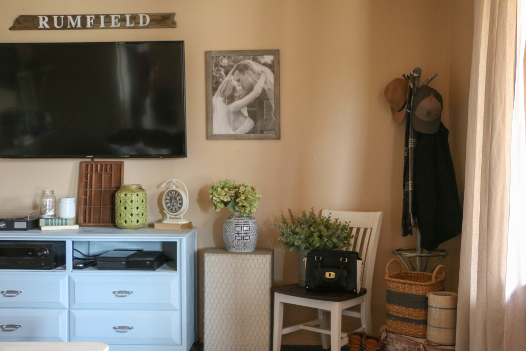
The last and most important (in my opinion) part was the basket on the far left. It took me a couple of weeks to find a basket big enough, but I finally found one large enough to fit the subwoofer, power strip, and X-box controllers. I painted the bottom half of it the same color as the speakers just to break up so much of the tan color on the front. On the backside of the basket I used wirecutters to cut just enough of the weaving to push power cords through. Topped with a blanket, you cannot even see all the necessary uglies inside!
My goal was to make the speakers look more like a piece of furniture that belongs in the room, rather than an eyesore that I have to crop out of photos.
Ethan even agrees that they look better, and luckily for me, it doesn’t affect the sound quality having the chicken wire over the speakers. Also note the printer’s drawer? That conveniently covers the cord that hangs from the TV.
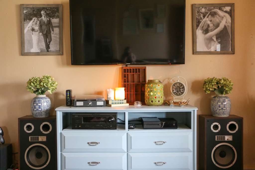
Maybe I’m crazy for thinking this, but technology is just ugly. If it were up to me, I wouldn’t have any of this stuff in the house at all. What a beautiful sight that would be! But alas, this is the life we live. The remaining visible pieces are the few that I don’t mind having out. The record player on top is where I play my Julie Andrews and Johnny Cash, and the other stuff needs to be accessible for the remote. Overall, I am so happy with the way this area looks.
It only took a year and a half, but I do love how this turned out.
And just for fun and a good laugh, here’s a throwback to what this area looked like when I first moved in after we got married. (Ethan lived here alone before we were married and I moved into his turf.)
YIKES. I know. I may not know much about design, or have a beautifully furnished house that I’m completely in love with, but at least I can sit back and be proud of the fact that we’re not living like this anymore.
Okay, enough of my ranting. I hope you’ve gained some ideas for yourself. I am so much happier with our new setup! How do you organize your media area? I’d love to hear about it! That’s all for today, friends. Have a fabulous day!

No Comments