Hello there friends! I hope you’re having a wonderful Monday! It’s a three day weekend for me, so you know I’m having a great Monday! This past weekend has been really really awesome. I’ve gotten SO MUCH done, and I’ve been inspired to do several new projects. On Saturday, Ethan and I took the trip down to Magnolia Market (Joanna Gaines, Fixer Upper, fabulous home decor, my idol, you get the point). It’s only about an hour drive for us, but it was the first time we had been since they’ve opened their larger store.
I bought two small items while I was there, and it inspired me to update a little gallery wall we have in the corner of our bedroom. Now, since I had spent all my money at Magnolia Market, I didn’t have any more money to buy anything new. So, I had to get creative.
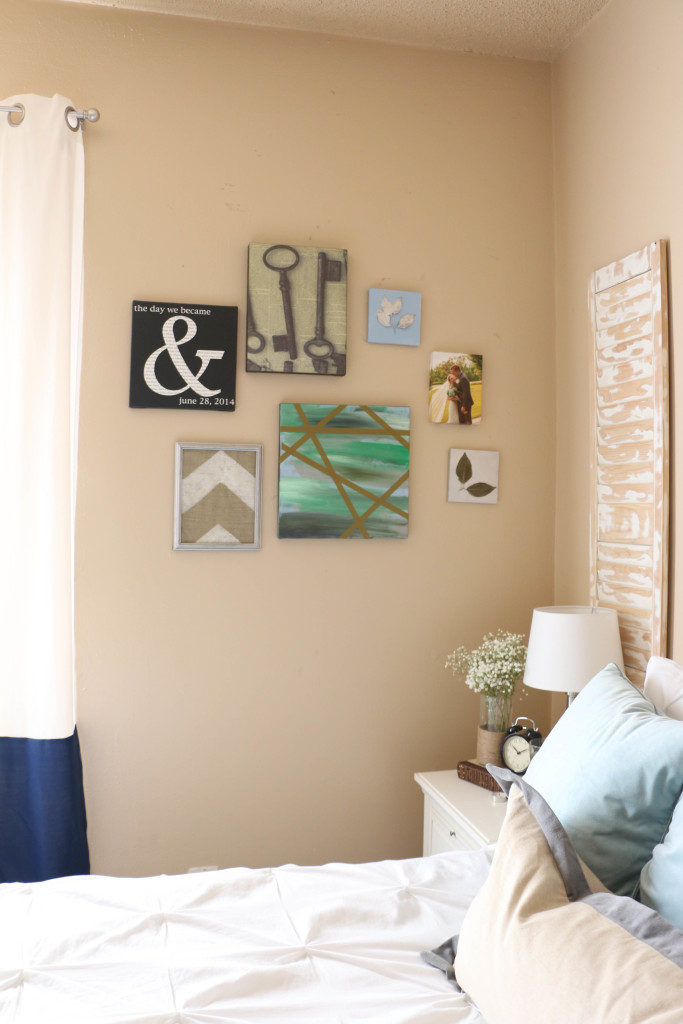
This is what this little corner of the room looked like before. I made/put together most of these pieces immediately after moving into the house when we got married. Let’s not talk about the multicolored canvas with washi tape all over it. Just, don’t even mention it. Obviously, this isn’t really my style. So when I brought home something new, I knew I needed to update this whole little corner. Here’s how it looks now:
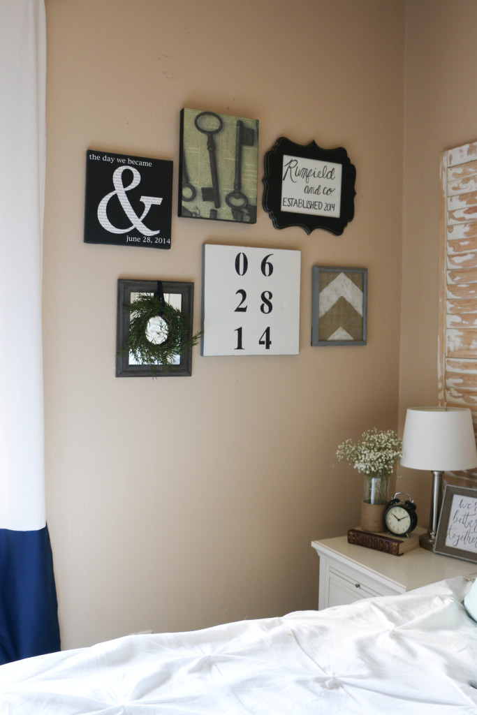
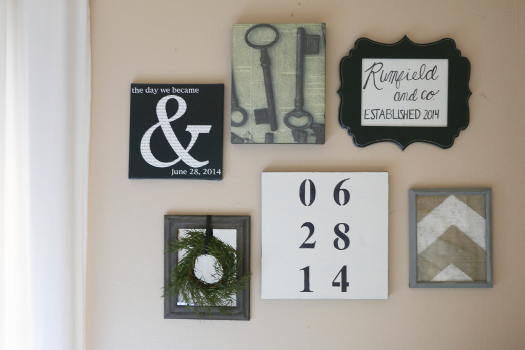
The entire theme is a bit more neutral and monochromatic, which fits in this room SO MUCH BETTER. As you can see, some of the pieces stayed the same, but the overall look is something I’m much happier with. So let’s talk about how I got my creative on without any money.
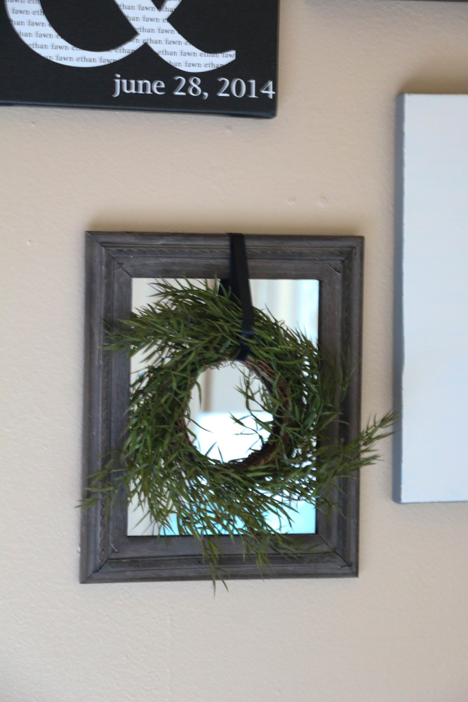
This is what I purchased from Magnolia Market this weekend (pardon this blurry picture, I don’t really know what was going on). The frame and the wreath came separately, but I attached the wreath with some thin black ribbon to the back of the frame.
The hand lettered sign on the top right was something I whipped up with a Sharpie. Nothing fancy at all. The frame was something I had in storage with something else inside. I had never hung it because I wasn’t a fan of what was previously in the frame, but with a little art swap, I was good to go. I also moved the burlap arrow frame to the other side of the wall and painted the frame from a metallic silver to a matte gray. Just another way to go a bit more neutral.
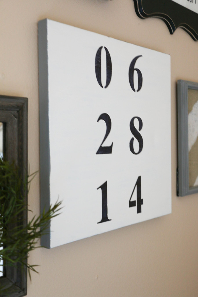
This piece is the biggest statement on the wall, and my personal favorite. It took Ethan a bit to figure out what “all those numbers mean,” but it’s our anniversary date. I used the same canvas from the first photo, peeled off the washi tape, and painted white over the cringe-worthy painting. I used stencils and a Sharpie to create the numbers, which was so easy anyone could do it! I believe this canvas was originally a picture of Audrey Hepburn I had in my college dorm room. It has now lived many lives! No one will be able to say that I didn’t recycle!
The other pieces from the original wall got trashed, as they had been reused one to many times, with the exception of our wedding photo, which will be relocated. 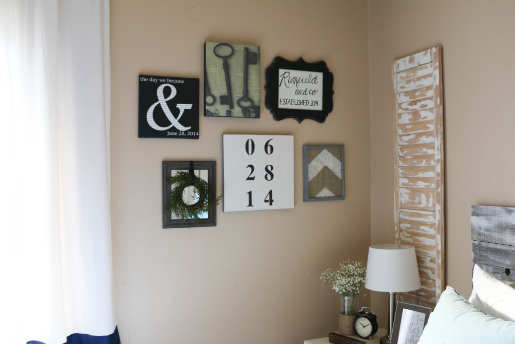
This little corner may not look totally different to everyone, but to me, the entire mood has changed now that it’s underwent its little makeover. It look me maybe an hour to update and make the three pieces, and aside from the new mirrored frame, it didn’t cost me anything.
Bringing new life to old gallery walls doesn’t have to be expensive! Look at the pieces you have already, and imagine new ways to rework them. Canvas can always be painted over, frames and always be painted. I’ve been known to hang wrapping paper in frames as cheap art, or free printables found online. Handwritten notes or drawings can also make great (free) additions to gallery walls. If you’re strapped for cash, look around your home and see what you can come up with! You might be surprised at what you find you already have.
What’s your go-to piece for artwork? Have you ever made a gallery wall mistake like I have? I’d love to hear about it! That’s all for today, friends. Have a fabulous day!

1 Comment
I’m not sure where you are getting your information, but great topic. I needs to spend some time learning more or understanding more. Thanks for excellent info I was looking for this info for my mission.